Seems alright to me.
Is the browser back function not working (when going back to the Chat/Bike page from a thread) a feature, a bug or a browser setup issue?
I like it 👍.
I like it! 👍
Works for me and is clean and clear View on samsung s21. So long as it doesn't log in me out everything I use it I don't mind
How do you logout?
I like it 👍.
Really interested to know how you navigate in and out of threads across multiple pages and back to overview and still say that. 🤔
You know when you pull into a parking space, come to a stop and the instant you do the car next to you starts reversing and you freak out and momentarily think you're still on the move?
It's like that when you post a reply now. 😂
Proper rubbish. I nearly subscribed yesterday.
Might have to bow out of this mess for while.
Got a PayPal donation button sorted yet ?
Like Button, Avatar ..........drifting away.

See you around guys.
Where's the forum search gone?
Sorry but it’s awful
Seems alright to me, on mobile at least. It isn't the paradigm shift I was expecting.
I'm most astonished at how many people don't know how to use a Web browser in 2022.
love the time limit on all links and options .... f5 and it's race the page loading when all links die, I'm lucky to have shit web connection otherwize it would be unusable. At the moment it's just a pain in the arse.
I think it's much better. I like that you can now see who has started a topic when browsing on a phone so it's easy to see which threads never to click 🙂
I’m most astonished at how many people don’t know how to use a Web browser in 2022.
Not as astonished as I am by how many people don't know how to mend a puncture 🙂
I’m most astonished at how many people don’t know how to use a Web browser in 2022.
Not seen any examples of that. What do you mean specifically?
Back forward up down refresh etc, this is all core browser functionality. You want to open pages and keep the index handy, just right click or long press and open in a new tab. Pulling down at the top of a page (mobile) or hitting F5 (desktop) will reload the page. And all of this stuff is also in menus.
Yes, a lot of the requests here would improve the UX of course, but they aren't necessary.
Click with mouse wheel to open in a new tab
Yes, a lot of the requests here would improve the UX of course, but they aren’t necessary.
Yes well as you've said, these are all things that would improve the user experience and the point is we had a lot of them before so why get rid?
Much of that browser stuff people can do of course, it's just that it's annoying as hell, and doubly so when that functionality existed this morning and worked well.
Back button isn't the same as overview button as I've said previously. Also, functionality seems to differ a lot across devices. Many on android can seem to hit the clock and go to the top of the page, but many can't, including me.
But yeah, of course all of these things can be done in some way, but why remove functionality in the first place?
Doesn't make sense.
Pulling down at the top of a page (mobile) or hitting F5 (desktop) will reload the page. And all of this stuff is also in menus.
Yes I know, but to pull down the page or get to the menus, I need to be at the top of the page. I'm here at the bottom, at the end of the thread. Why not a simple button or even the menu that appeared before with a slight scroll?
If I have to scroll back to the top anyway then I may as well just hit overview instead of pulling down. But again, why is it better to have to keep scrolling back to the top?
The Tech bods making a list of bugs and feedback.
Still no "Jump to first new post" option. It's basic forum functionality, you'd think one of the three devs would have decided to put it in.
But yeah, of course all of these things can be done in some way, but why remove functionality in the first place?
Doesn’t make sense.
You could be describing Google Wallet.
The Tech bods making a list of bugs and feedback.
I'd best mention it here too then... The "Are you sure you wanted to do that" bug when using Chrome, which has been around forever, seems to have been fixed.
@kayak23 it seems that the overview page auto-refreshes when you go back to it. I think this is a change they made a few months back, but I've never been bothered to test it until now. I'm on Android 9 on a 4 year old Xperia Compact.
@kayak23 it seems that the overview page auto-refreshes when you go back to it.
Well, you may not want it to refresh though. That's why you hit back after all, because it takes you to where you were in history.
I've used the back button before when I've typed a reply and then the site has crashed. Often you'll still have the text you wrote waiting there. It would suck if things refreshed automatically and you lost what was there before you hit 'enter' as that isn't what back is.😂
Besides, if you've read every page of a multiple page thread, hitting back just takes you through those pages again, backwards.
I'm with you on the multi-page thread thing, but I thought your objection was the extra actions required to get an up-to-date overview? Obviously misunderstood. I agree that the 'back to top' followed by 'overview' that we lost in the refresh before this was the simplest and easiest way to do this, and I still miss it.
Yes, a lot of the requests here would improve the UX of course, but they aren’t necessary.
Maybe they are to the users...
Seems like I'm the only person here in agreement with @cougar.
It'd be nice if we could all post constructive criticism rather than, ya know, unconstructive criticism.
I hate most new generations of car when they come out. Until I'm used to them, at which point I think how outdated the old models look.
Towers are doing a tough job and it's a bold move. I'm all for it personally.
Some A/B testing may not have gone amiss by the sounds of it. But simple 'I hate it'/'I preferred it when me magazine got dropped off wi' me loaf of 'Ovis' posts don't really help anyone.
For the powers that be, may I suggest a quick survey after a fortnight, focusing on the new look and functionality and how they've been received?
Then at least you can start to refine focus and quantify.
I’m most astonished at how many people don’t know how to use a Web browser in 2022.
I'm heartened to know that this particular site feature (any issues with the forum are the fault of the users) hasn't been lost 😀
PS I couldn't post a reply on my mac (Chrome browser), as the reply box is dead/not clickable-on. Opened up site on mobile, navigated back to thread. Scroll to bottom to reply. 'you must be logged in to reply'. Ok cool, I guess that's a link to the login page? Nope? Where is it then? Ah, back at the top. And once I log in, I'm directed to my profile. And now I have to go back to the homepage to find the thread again, or just swipe back, except I can't because now the page is a massive uncancellable advert and...
Does anyone who builds the forum ever actually try using it?
Can we have a game of 'show us your forum'?
Bonus points for those who are attempting to improve things for their users in tough times.
Negative points for those who believe they can do a better job. Or just can't seem to express anything in a constructive manner.
Works fine here. The problem is that this place is chock full of grumpy middle aged men. Change is not something embraced by this demographic.
I like the contrast, makes it easier too read.
Too many colours in the main page and the reply/report need a better contrasting colour too.
Being from Yorkshire and a 50 year old grumpy git, I don't handle change well.
However I like the new look on my laptop. Seems cleaner and sharper.
Iphone forum takes a bit of time to love, but it is growing on me.
Well done STW for having the notion of change, it can't be an easy decision to rock the boats of grumpy old (and not so old) men 😉
Works fine for me on Chrome using an iPhone in portrait.
I like it. Easy to use, easy to navigate. Very clear.
Far easier to read on an iPhone. Especially for an old fella
Thumbs up
Works fine here. The
Good for you. Says an OAP here who's doing his best to get his ancient head around it.
Sorry for being thick. 🙄
I think broadly speaking it looks good, particularly on mobile.
A couple of (hopefully) constructive points:
- It seems harder to navigate back to the overview - the 'back' button or a swipe takes me to an old cached overview.
- The font works great on mobile but hurts my eyes a bit on desktop. Maybe it's something to do with contrast or something but I really can't look at it for long.
Clear layout, easy to read, seems more responsive on my phone. What's not to like?
I hate most new generations of car when they come out. Until I’m used to them, at which point I think how outdated the old models look.
I get your point. I'm an advocate for change, for evolution, for improvements. Certainly like a fresh visual take on something.
Not trying to be 'unconstrictive' as I think the people at stw are fantastic and put up with a lot of moaning, and here's the but.
But, removing basic functionality isn't really an advance, no matter how you dress it up or what analogy you use.
What if your new car had 6 gears and a fresh new colour, but they'd inexplicably removed the gearstick in the updated model? 😉
Someone moved the furniture whilst I was at work. Hopefully there won't be any stubbed toes in my near future. On the plus side two zoom-in operations mean I can read the overview page without reading glasses while my contacts are in. A boon for the older long-sighted man.
Overall, I like it. Couple of accessibility issues with my web-head on (and trying to be constructive!)

The almost black on dark gray is way below an acceptable contrast ratio. Webaim (who look to maximise web accessiblity) shows this combination as
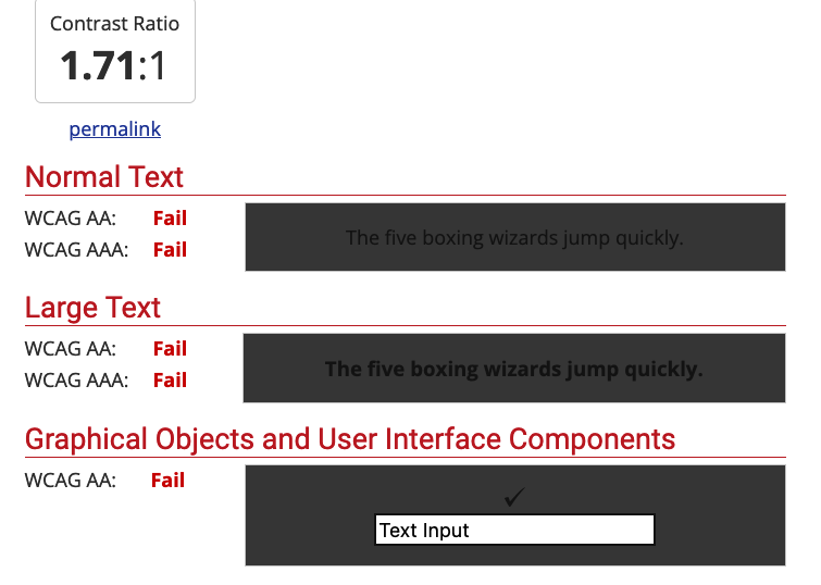
Contrast ratios should be > 4.5:1 for normal text.
Similarly, the 'active page' indicator does have much contrast between the active page and the rest. I've not been using this long but have already had trouble working out where I am in a thread.

Sorry for being thick. 🙄
Not thick at all. Just old 😉
Not thick at all. Just old 😉
Yep, qualified for my state pension on 22nd August.
Good luck, hope you make it. 😂
I love the new look. No contrast issues for me… looks nothing like JCA says above.
I also like it when things like this change as it keeps my brain active reinterpreting the screen.
No contrast issues for me… looks nothing like JCA says above
Yup, same here
It's bare bones in here 😕 How about some pictures for the walls.
And the Bike Chat toolbar links have become Chat Bike toolbar links. They're the wrong way about.
