To counter the other thread running currently, please share your most-gopping paintjobs.
I'll get the ball rolling with one of my own former steeds...

Should have worn a paper bag over my head when out on it.
Anything tan / sand......
The paint splatter job on 89 Kona Cindercone.
Huge logos everywhere - made worse by bright colours. Hideous
Bright red frames.
Anything anodised purple.
Colours that are almost the same but not quite.
The brown and tan fashions (Kona Stinky and pretty much everything year).
Garish clashing colour schemes with large logos.
Too many matching components (less is more), you know when someone adds, pedals, rims, hubs, cranks, stem, bars and grips all on the same bike.
The current Boardman range looks really cheap and the decals look naff.
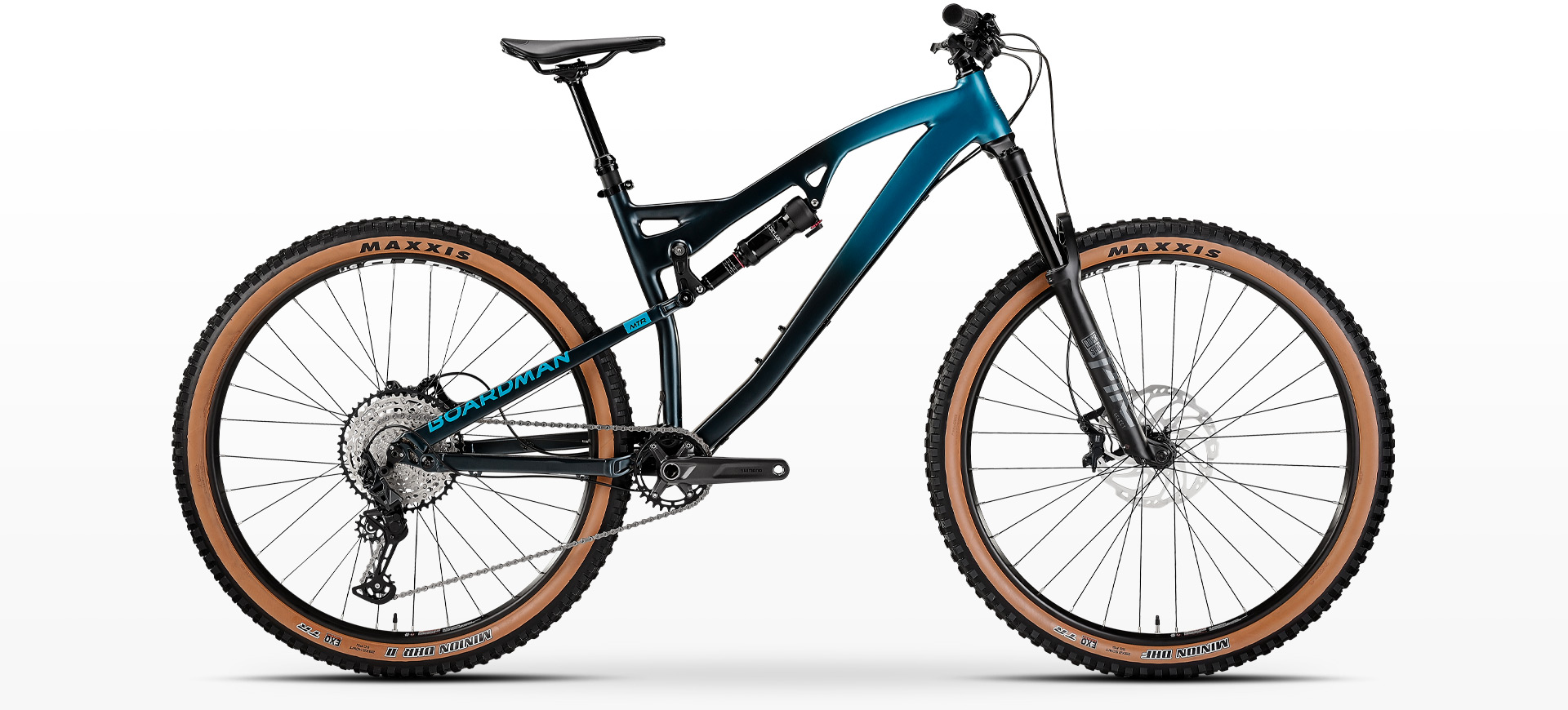
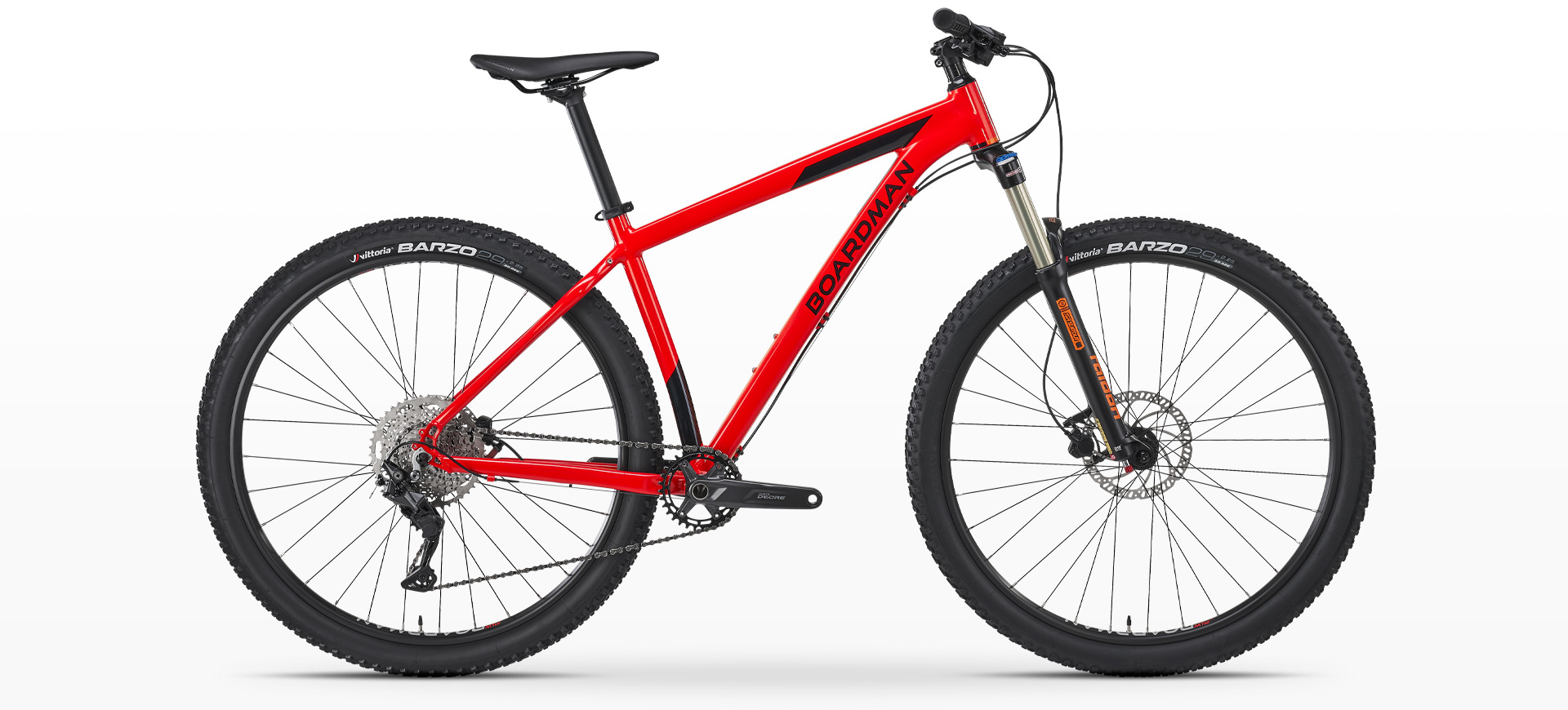
Shame, as a few years ago they looked good.
The current Boardman range
This one is very gopping, but how much is the disgusting frame shape vs. the colours?
More pics please folks.
Anything in Austin Allegro Beige......

Agreed on the sand colours, and this one is made even worse by the silver parts and gimmicky suspension...

Anything matt black. Dull, dull, dull.
Anything sand, beige, yellow, orange etc combined with Kashima stachions.
Well, my next project has elements of a fair few posts here, so maybe give my next new bike day thread a swerve 😊.
The trouble with matching (or trying to) with kashima is the colour is a little like Forrest Gump’s mums box of chocolates…
Anything with those Enve huge logo wheels that match cables and frame decals.
It would appear that a lot of people on here don't like brown.
I have a brown Roadrat.
Great bike, but I too hate the colour.
The advantage of it is that since everyone else does too it was significantly cheaper than a black one🤣
Coloured anodised components in garish colours. HIdeous especially when they do not match or deliberately clash
My bike is matte black with purple anodised everything. And I like it. So there 😂
My brother has the same bike but in a hideous bright orangey-red, and has anodised blue everything. Looks ****in awful. It's an affront to those blessed with the gift of sight.
My dad has a sand coloured Cube with orange bits and tanwall tyres, and it looks mega.
I think stealth is always better than anything in yo' face tbh.
Huge rim decals in orange,yellow,green or pink are hideous. Enve, Reynolds, Six element especially. Also, weird shades of green frames that don't go with anything.
Aything black or matt.
I'll gp with black tyres and possible cables but otherwise foul.
I had a blue foxy with yellow decals. I colour matched the pro4 hubs etc blue. Then when I snapped it mondraker sent me a black frame with white decals so now everything clashes. Luckily I don't have time to wash it much so it's harder to see the colour clash.
But brown and beige looks more gopping.
@spanishfly you’ll be pleased to know it’s had an outing at a biblically wet Bike Park Wales today, and after a day of riding, it looks…
The same.
Bright red frames.
Nah, very useful for finding bike in the foliage after emergency eject.
I had a metallic jobby brown willier gravel bike.
Willier said burnished bronze but really it was as tenuous as Aberdeen's claim to be the silver city.
‘Chip shop curry’ was the official name for a colour by Ragley a few years back.
Made the paint on Austin Princess’ look acceptable.
On One need an honourable mention.

One of mine from quite a few years ago. Either untouchably cool, or horrendously OTT - your call.
In defence of the bartape, it was my 6 year old (at the time)'s choice and I couldn't say no.

Coloured anodised components in garish colours. HIdeous especially when they do not match or deliberately clash
+1. I got a (used) bike build that had been specced with Hope everything. Unfortunately the bloke (bless him it was his pride and joy) attempted to match the blue bike-name sticker with blue-anodised Hope bling, ie QR levers, B/B-cups, headset, even the (non-Hope) control-cable nipples. It would cost me more than I could either afford or justify to change it all b(l)ack. The parts don’t even match the blue sticker. At all. Some don’t even match each other.
I sold the wheel-skewers to be fair. I suppose I could sell the bling off in parts. Sell one, buy one. Then it will finally be my pride and joy. Albeit boring looking. Horses for courses.
At least it wasn’t this (apologies in case):

Not sure I should've read this thread.... I give you:
Anything tan / sand……
[url= https://i.postimg.cc/d1scLQ0z/20210908-120431.jp g" target="_blank">https://i.postimg.cc/d1scLQ0z/20210908-120431.jp g"/> [/img][/url]
The paint splatter job on 89 Kona Cindercone
mine's now converted to 1x11 but will revert to SS for winter (it's paint splatter, but not sure how compares to the 89 cindercone!)
[url= https://i.postimg.cc/59SJtk6r/20180408-135801.jp g" target="_blank">https://i.postimg.cc/59SJtk6r/20180408-135801.jp g"/> [/img][/url]
Been hovering over the buy button for an Intense Sniper T for months but for various reasons (mostly financial!), haven't hit buy but the paint scheme doesn't help...

The paint splatter job on 89 Kona Cindercone.
I bought one of those brand new at the time because it was a great bike to ride. I never liked the paint job but still bought it anyway.
Specailized's current trend of not fading two colours into each other on down tubes but making it look like they masked off the frame to paint two different colours then just removed the masking tape and left it like that
Just what you want on 8-13k bikes!
Black is dull (I have a black bike), my new bike is silver, which is also quite dull. For anodised parts I like pewter/ gunsmoke - why did Hope stop doing gunsmoke?
Definitely agree on the too many matching components. Someone I used to know loved adding blue components to their bike - blue bar, blue stem, blue anodizing on the grips, blue cranks, chainring and so on - it was just too much
In recent years the colour of Santa Cruz bikes - they seemed to be at the forefront of the bad shades for brown trend
escrs sed about>

I couldn't ride that without wanting

I would have suggested matt grey but I actually bought a Cube Nutrail - on offer- in grey and black and it's not too bad after all. I wasn't fussed about the colour when I bought it as I'd planned to transfer all the components onto a Ti frame but I've still not got around to ordering that.
It's not hard to build a good looking bike imho as long you stick to the following:
- Black frame and black everything else.
- Black frame and a few choice coloured parts but not too many.
- Bright coloured frame with all black components.
- Stay away from big logos
Or just buy a Trek as their colours (the ones I've seen of late) are lush.
Yellow with the usual black. Too wasp like.
Specialized and Kona had some horrendous ones around 2006-2008.
If I recall correctly there was an Argyle tartan SX trail, or Demo 7.
Not even a mother could love....
Any Trek with the brand splashed across the downtube in enormous white letters...it looks bloody awful. I own a Trek btw.....the letters are black on black, much better.
Look at this abortion!

Good lord that's every kind of awful.
Was that a production frame?
🤮
