UPDATE: Reviews section refreshed, redesigned, searchable: Go take a look
Upgraditis on a bike I don't even have yet has got me thinking about this...
There's just certain things I dislike the look of for no good reason. I don't mean a dislike of brands, more just the way things are made, set up or the shape of certain things.
One of mine is my stems have to be angular in shape, like the ANVL Swage or Title ST1 for example. I really don't like stems where the steerer section is rounded (Gusset Staff, Hope TR, most Race Face stems etc). I also, inexplicably, don't like cast stems.
Another is on hardtails or gravel bikes, I don't like it when the seatstays join the seatube lower than the downwtube.
Seatstays that curve toward the rear axle annoy me too, like on the Marin San Quentin.
Whatever is going on with the downtube/BB area on newer IBIS bikes, that weird little shelf thing they've created to fit a bottle mount in under the shock. Nope.
Silver spoke nipples have no place on expensive bikes. Silver rims too, with the very odd exception if the rest of colour scheme is done right.
It would too easy to pick on Orange here.
Anyone else a bit weird?
My Cotic Escapade came with a PRO branded stem. It has the logo printed on the top. It's not symmetrical. Annoyed me every time I looked at it, to the point where I got a replacement for xmas.
29" wheels on small sized bikes (i am small myself and have a specialized chisel fs 29"). tbh i would rather have 27.5" or 26".
My Cotic Escapade came with a PRO branded stem. It has the logo printed on the top. It's not symmetrical. Annoyed me every time I looked at it, to the point where I got a replacement for xmas.
I would have done exactly the same. I had PRO gravel bars and the logo always bugged me. I bent them in a crash so not an issue now 😀
29" wheels on small sized bikes (i am small myself and have a specialized chisel fs 29"). tbh i would rather have 27.5" or 26".
I can see why this would be annoying. Seems more brands are putting smaller wheels on their small bikes now though. Trek spring to mind but there are definitely others.
Tan wall tyres, and coloured tyres like white ones or camo looking ones on street bikes, long droopy stems, flat bars, egg beaters, braided hoses are all mild visual annoyances.
What I really hate the look of on bikes is:
-Phones strapped to handlebars in cheap waterproof cases
-Too much bling, anodised and colourful everything
-Too much matching bling, like a black bike with orange decals, orange calipers, orange hubs, rotors, pedals etc
-Frame triangle bags
-Bullhorn handle bar attachments
-Triple clamp forks on ebikes
-Saddle bags
-Foam Grips
-Panniers
-Massive mud guards like SKS mudrocker, even worse if its the cheaper ones that attach to the seat post, looks like they wish they had a gasgas 249cc trials bike instead
-Slack seat tube angles
-yellow Rubber ducks on handlebars, it's fine if it's a black rubber duck though
EDIT: Oh and I know this isn't on bikes, but fingerless gloves. Like, we're in a time and space where products have gotten so good that full hand MTB gloves in every situation are better than fingerless ones. But I digress this is bike related stuff we find aesthetically displeasing, not rider fashion we find aesthetically displeasing 🤪
any frame tube that seems to take the scenic route between the two elements its connecting.
If you straightened the tubes on a giant reign and cut off the excess you'd probably have enough material for another frame
Tan wall tyres, and coloured tyres like white ones or camo looking ones on street bikes, long droopy stems, flat bars, egg beaters, braided hoses are all mild visual annoyances.
What I really hate the look of on bikes is:
-Phones strapped to handlebars in cheap waterproof cases
-Too much bling, anodised and colourful everything
-Too much matching bling, like a black bike with orange decals, orange calipers, orange hubs, rotors, pedals etc
-Frame triangle bags
-Bullhorn handle bar attachments
-Triple clamp forks on ebikes
-Saddle bags
-Foam Grips
-Panniers
-Massive mud guards like SKS mudrocker, even worse if its the cheaper ones that attach to the seat post, looks like they wish they had a gasgas 249cc trials bike instead
-Slack seat tube angles
-yellow Rubber ducks on handlebars, it's fine if it's a black rubber duck thoughEDIT: Oh and I know this isn't on bikes, but fingerless gloves. Like, we're in a time and space where products have gotten so good that full hand MTB gloves in every situation are better than fingerless ones. But I digress this is bike related stuff we find aesthetically displeasing, not rider fashion we find aesthetically displeasing 🤪
Good list, most of which I agree with especially the mudguards.
I have to confess to being a tan wall aficionado though. Have them on my mtb and gravel bike 😋
any frame tube that seems to take the scenic route between the two elements its connecting.
If you straightened the tubes on a giant reign and cut off the excess you'd probably have enough material for another frame
Haha, that's spot on!
Just modern MTBs in general, especially full sus. They look like they've been dropped from a great height with an elephant on board, wheels splayed outwards, top tube crunched up.
[img]  ?v=1728748154&width=1445[/img]
They just look fugly.
Road bikes have (generally) become quite smart. MTBs have a rat's nest of cabling out front and a front wheel in a different postcode to the rest of the bike.
e bikes. Face it, they're all gopping aren't they.
White lycra. No, you can't get away with it.
I'm on board with eatmorepizza.
I'll also add mismatched tyre brands, the top manufacturers have enough options to cover front and rear, and whilst we're at it, align your valves with the logos. It's the detail's that are important.
E bikes, carbon frames, white forks, gravel bikes.
Proper MTB rear mudguards. But I still tolerate one for the “commuter” bike…
Nothing says you’ve given up on life more than pogies on your bars.
I'll also add mismatched tyre brands, the top manufacturers have enough options to cover front and rear, and whilst we're at it, align your valves with the logos. It's the detail's that are important.
Both of these should not be open to debate at all, along with only taking drive side photos of your bike.
Rear mudguards… no one has made one that looks right on a mountain bike.
Just to shift the dial from all the Eeyore's up there I find boring bikes displeasing. Black everything with a dark grey frame, yawn, boring. Bikes are meant to be the things we enjoy so why make them look like a wet Tuesday afternoon in February? Well executed stealth is acceptable though.
“Just modern MTBs in general, especially full sus. They look like they've been dropped from a great height with an elephant on board, wheels splayed outwards, top tube crunched up.”
Hello roadie! Older MTBs look like they were designed without considering we like riding DOWN hills…
Step cast forks. The legs are too close together.
The coloured stripe on schwalbe tyres. At least make it straight!
The way every helmet makes my head look like a mushroom.
On gravel and road particularly, sprockets significantly bigger than chainring(s).
And to be honest some of the HT550 setups last year looked pretty daft as well, am sure there was a 28 tooth chainring and 52 tooth sprocket combo. Just get a front derailleur 😂
AXS derailleurs
Got used to most ebikes now, but those fat downtubes are grim really.
The Canyon logo with its leaning back font
High pivot rear sus with the silly chain
I love that Canyon logo, and how they use it on the bikes.
Transmission mechs though… oh boy… totally out of proportion and in your face, as if the designers want you to notice it before you even take in the frame. They probably do.
Red bikes.
There is some red amongst the black and blue paintwork on my trusty 650b Anthem.
Trusty, because it’s been a great bike for many things. Racing, Endurance rides, pratting about in the woods. It’s a truly decent bike and it had exactly the spec I wanted.
I’ve never loved it though because of the red .
Maybe that’s why I never bothered with wrapping the frame from new or worry if it gets another stone ding.
Dropped stays on road bikes. Fugly as hell.
Kind of agree about the look of LLS mountain bikes. I get the function over form thing, but I'm an old school bimbler
Crown mounted mudguards, particularly on USD forks.
Handguards.
Bar ends on riser bars.
White tyres.
Long stems, narrow bars, short n tall frames with dinky little wheels, pretty much any MTB made Pre 1998 really. In isolation they’re fine, but stick a human on top (and it is plonked on top) and they look ridiculous.
Fine with bling, obvs lol, but it must be tasteful (ish) and not just everything in the Hope catalogue (ideally black or silver)
Road cyclists
derailleurs particularly modern ones
riders with a mud stripe up their back because they wont use mudguards
Just modern MTBs in general, especially full sus. They look like they've been dropped from a great height with an elephant on board, wheels splayed outwards, top tube crunched up.
[img]
They just look fugly.
Road bikes have (generally) become quite smart. MTBs have a rat's nest of cabling out front and a front wheel in a different postcode to the rest of the bike.
Those Radicals look ace
Anyone, male or female, that isn't built like an athlete, wearing lycra
Coloured resin pedals - pink being the worst. With matching grips
All the dull uninspiring paint jobs that are on bikes now "builders tea" etc, beige bikes for beige people listening to beige music on radio 6.
Whats so great about you?
All the dull uninspiring paint jobs that are on bikes now "builders tea" etc, beige bikes for beige people listening to beige music on radio 6.
Bikes where the ht angle (or rather the angle of the fork legs if it’s rigid) being steeper than the seat tube. Looks like it’s been run into a wall.
the bb area of most full fat e-bikes look droopy and bloated like Donald trump’s cankles.
open face helmet with goggles.
-yellow Rubber ducks on handlebars
My mate turned up to a ride with one. He was in a funk all day because it lasted 5 mins before it was unceremoniously ripped off the bike.
Rear derailleurs that are almost scraping the ground.
Dinner-plate sized cassettes.
Tiny chainrings that aren't hidden behind a larger one.
Shock linkages that look like they belong on a steam train - especially those acting on a vertical shock.
I like a bit of colour on a bike, but what I don't like it when someone has tried to match the anodised colour with a painted colour. They're never going to match, pick one and stick with it. Either will work, but not both.
However, I'm guilty of one listed above. Gravel bike lowest gear is 51/38. Cassette is noticeably bigger than the chain-ring.
Any bike without Mudguards.Looks like a body with no clothes on to me.
Torn over the mudguard comments. I'm not going to try and claim they look good, but the benefits are such that they get a pass. Agree with @tomhoward that the moto style crown mounted ones on USD looks crap but again, there's often not a better option.
Another is on hardtails or gravel bikes, I don't like it when the seatstays join the seatube lower than the downwtube.
Far be it for me to point out the obvious... But a seatstay joining the seat tube lower than the down tube isn't a seatstay at all, but is definitely in fact, a chainstay...
Or did you mean [i]Top Tube[/i] perhaps...? 🤔
the bb area of most full fat e-bikes look droopy and bloated like Donald trump’s cankles.
Again, far be it for me to point out the obvious... But to resolve this issue, the bike would no longer be considered an eBike! 🤔
Just modern MTBs in general, especially full sus. They look like they've been dropped from a great height with an elephant on board, wheels splayed outwards, top tube crunched up.
Disagree regarding "modern MTB's in general, especially full sus"... But you then posted a pic of a modern hardtail, with what looks like an 80deg SA and about 62deg HA, and I would absolutely agree that this really irks me on hardtails... The simple fact of the matter is hardtails don't really work for the kind of riding where a massive wheelbase, super slack head angle and super steep seat angle are required, so why bother? The lack of suspension or eBike gubbins within the frame, highlights the contrast between the two angles and makes it look particularly ugly IMO too. But it becomes even more pronounced on a bike like that one pictured, where they have utilised the super steep seat angle to make the back end as short as possible whilst the front end is in a different postcode... Just looks awful!
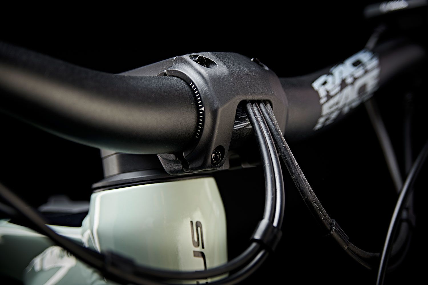
Beyond that... I'm really not a fan of top tube humps, a la Haibikes, Santa Cruz's and Mondrakers past... And the fascination with internal cable routing that has progressed to some bikes where stems have evolved to look like a small creature eating a mess of black spaghetti... 🤮
Just make them go away please!
The monobrow, single lens riding glasses, especially when sat on the Tube with no bike. 2 eyes, 2 lenses please.
Above glasses placed into a helmet for storage.
Road cyclists' shoes.
The Chinese frankenbikes ridden by London food delivery riders with couch-like seats and 10 inches of vertical stem.
A kick stand.
Those hideous Brooks saddles.
Bromptons. All of them.
Front mechs just look awkward.
Anything on top of a top tube.
Colour anywhere on disc rotors
Long seat tube masts. I love a low top tube, but just make buyers run a massive dropper, don't extend the seat tube up. And especially don't make it a different shape to the rest of the seat tube.
Coloured grips.
More than 1 Kashima item. It's too ostentatious and they won't match each other.
Bends in top tubes. I love how my Ripmo rides, but jeez, I wish I never had to look at it.
Silver rims.
Internal cable routing - cables disappearing into frames just looks like they are hiding a multitude of sins.
Top tubes with a kink in them, particularly up front.
Rear triangles on road and gravel bikes that look like they are too small for the main triangle but were used as they had a whole load of excess kids bikes rear triangles to use up.
Anything purple.
Those shitty electric mopeds pretending to be e bikes used by every bloody delivery rider.
Rear pannier racks that pretend to be some lightweight and fancy update on traditional rack design. See also tiny panniers that invariably are seen with them.
Bikes with no spacers below and above the stem. Slammed for the head down brigade who like a sore neck and shoulders on longer rides.
Pretty much every flat pedal shoe ever made.
Storage ports in frames answering a question that was never asked in the first place.
Cassettes that look like dinner plates.
Electronic droppers that look like they have had some kind of hernia develop at the collar or at the back of the saddle.
Raleigh Chopper - they were just rubbish bikes.
Lycra collars on winter boots - they can get in the sea.
Every Haibike and Orange full susser ever made.
Carbon fibre full sussers all adopting the Santa Cruz aesthetic so you’d be hard pushed to distinguish them from each other.
Full fat e bikes - all have fallen from the fugly tree. A bike that just looks heavy is not right.
Those ugly phone case / bags you see every delivery rider have barely strapped to their bike along with the external battery wrapped in plastic bags and gaffer tape.
E bike motors that look like a keel and almost scrape the ground.
Ride glasses with separate lenses that look like really cheap lab glasses.
Fork steerer tubes with holes in them to allow internal cabling to run through. I may not be able to see it but knowing it is there as an extra point of potential failure does not endear me to it.
Mullet frame set ups………………….
Well, you did ask…….
Or did you mean [i]Top Tube[/i] perhaps...?

I did in fact mean top tube 😊
Internal cable routing - cables disappearing into frames just looks like they are hiding a multitude of sins.
Top tubes with a kink in them, particularly up front.
Rear triangles on road and gravel bikes that look like they are too small for the main triangle but were used as they had a whole load of excess kids bikes rear triangles to use up.
Anything purple.
Those shitty electric mopeds pretending to be e bikes used by every bloody delivery rider.
Rear pannier racks that pretend to be some lightweight and fancy update on traditional rack design. See also tiny panniers that invariably are seen with them.
Bikes with no spacers below and above the stem. Slammed for the head down brigade who like a sore neck and shoulders on longer rides.
Pretty much every flat pedal shoe ever made.
Storage ports in frames answering a question that was never asked in the first place.
Cassettes that look like dinner plates.
Electronic droppers that look like they have had some kind of hernia develop at the collar or at the back of the saddle.
Raleigh Chopper - they were just rubbish bikes.
Lycra collars on winter boots - they can get in the sea.
Every Haibike and Orange full susser ever made.
Carbon fibre full sussers all adopting the Santa Cruz aesthetic so you’d be hard pushed to distinguish them from each other.
Full fat e bikes - all have fallen from the fugly tree. A bike that just looks heavy is not right.
Those ugly phone case / bags you see every delivery rider have barely strapped to their bike along with the external battery wrapped in plastic bags and gaffer tape.
E bike motors that look like a keel and almost scrape the ground.
Ride glasses with separate lenses that look like really cheap lab glasses.
Fork steerer tubes with holes in them to allow internal cabling to run through. I may not be able to see it but knowing it is there as an extra point of potential failure does not endear me to it.
Mullet frame set ups………………….
Well, you did ask…….