
“Jimbo has worked closely with the Bell graphics team for years for years,” explained Creative Director Eli Atkins. “It’s all been so well received, we worked with Jimbo to do a proper collection for this year.”
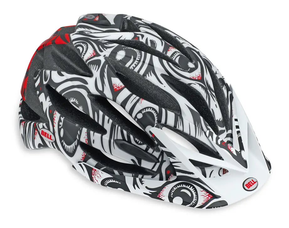
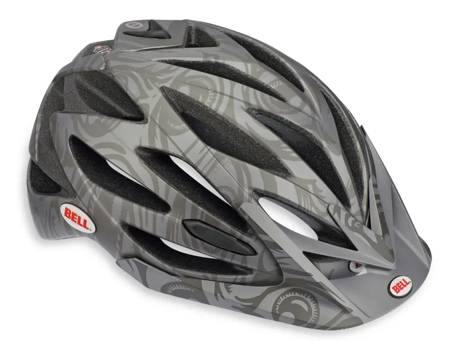
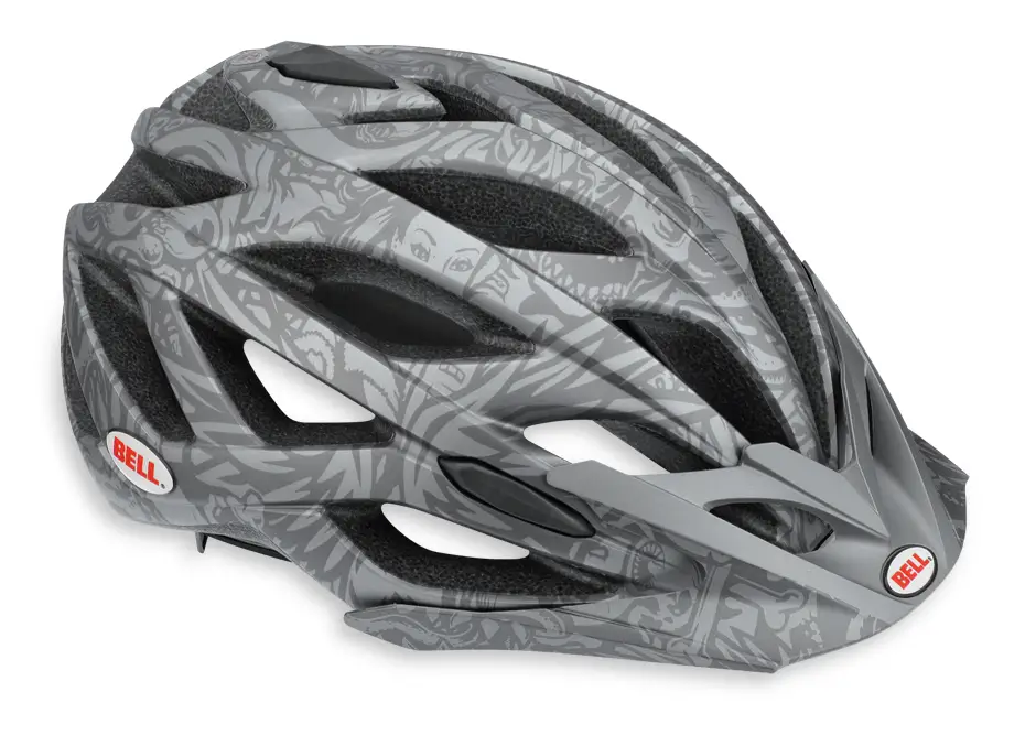
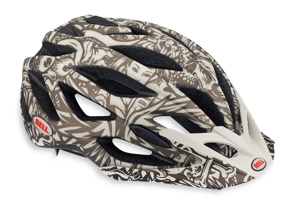
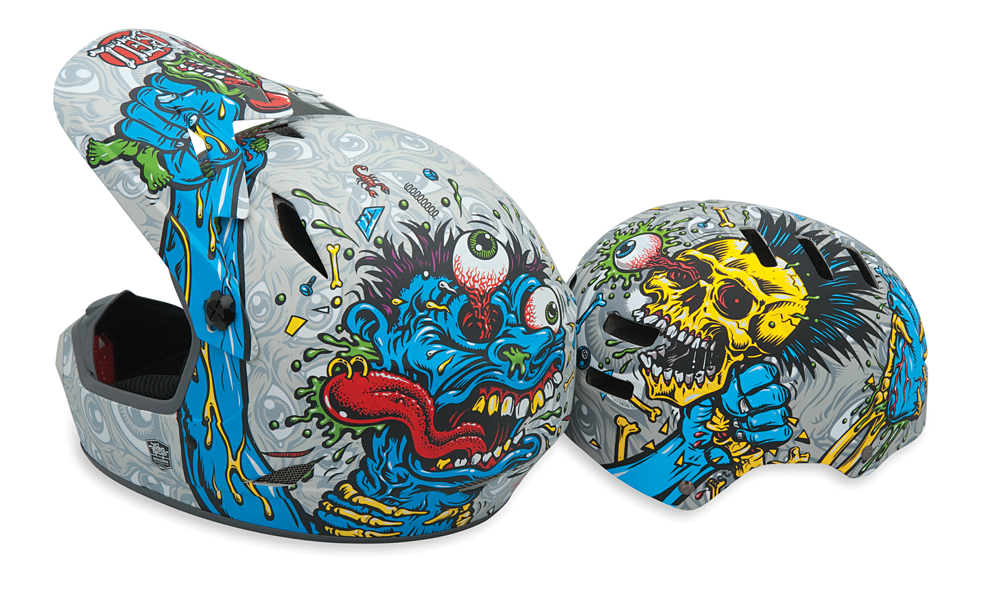
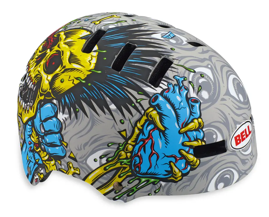
The Jimbo Phillips Collection includes two graphics on the new Sequence helmet, two on the Variant, two on the Faction skate-style lid and one on the Drop full face helmet. Included in the collection are a pair of coordinated graphics—one on the Faction and one on the Drop—that actually create a scene when viewed together.
“Generally, people are drawn to Jimbo’s work,” said Atkins. “But skeletons choking each other might be a little too in-your-face for some, so we had Jimbo do a few of illustrations in a little more abstract and subtle way. On the whole I think there’s something for everyone.”



Loving the ‘choke’ design, reminds me of Garbage Pail Kids.
The Screaming Hand is my favourite logo of all time…..however, there is a new contender, Jeremy Fish’s stuff for Evil Bikes is great.
So many beautiful things but I cannot possess them all. Variant eyeballs I think.
I’m surprised to say that I really like the “Sequence Chalk Wallpaper” one :-O
I like it too. Faces, eyeballs, bones, skulls – there’s a lot of good stuff going on there, but in a kind of subtle way.