- This topic has 29 replies, 22 voices, and was last updated 13 years ago by .
Viewing 30 posts - 1 through 30 (of 30 total)
-
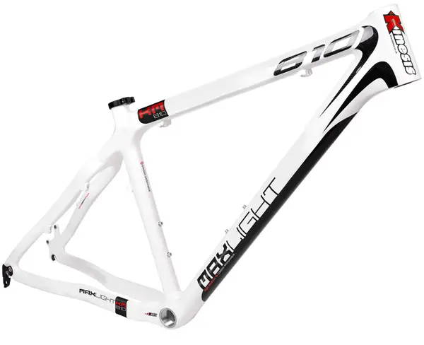
White On-one Carbon 456 – Eh?
-


Viewing 30 posts - 1 through 30 (of 30 total)
The topic ‘White On-one Carbon 456 – Eh?’ is closed to new replies.