[img] ![]() [/img]
[/img]
reminds me of my youth
For me the Underground logo is my favourite but there is some great ones on Grumm's link ( http://www.logodesignlove.com/negative-space-logo-design ) that I haven't seen before. Love these...
American Institute of Architects Center logo...
[img] ![]() [/img]
[/img]
Egg n Spoon logo (same day couriers)...
[img] ![]() [/img]
[/img]
Quite fond of this on a t shirt
[img]  [/img]
these because it reminds me of my skater days
[img] ![]() [/img]
[/img]
[img] ![]() [/img]
[/img]
I misread the title, I thought this was about my favourite LEGO.
Always liked the Quicksilver logo
H-street!! A blast from the past there 😀
I've always liked shell
[img]  [/img]
I think a great logo needs to be simple and makes you aware of the company even without any accompanying text.
In some cases though they can become familiar just through the volume of use - eg McDonald's or Mercedes.
[img]  [/img]
This is my favourite. I think it captures perfectly the spirit of the music it represents. For me it means so much more though, it's really the representation of the time in my life when I felt most free and it never fails to make me grin. Which is often, since I have it tatooed on me 😉 Someone recognised it on Sunday's Swinley ride, which is good going since Plastikmans heyday was really about 15 years ago.
I've been reading this book by some guy who worked at saatchi and saatchi, he was saying a good logo should be recognizable from the end of a corridor. So your Nike, Shell, Mcdonalds, Ford, Cadbury etc.
Saatchi brief when they set up the agency, was to make all the stationary etc, look like that of a bank (at the time banks were respected and trusted) 15 years later they tried to buy a bank.
my favourite is coca cola love the text and the bottle.
Take another look at the 2012 Olympic logo - anything about it remind you of Bart and Lisa? 😯
Amazon - everything from A to Z
[img] ![]() [/img]
[/img]
[url= http://www.b3ta.com/features/phalliclogoawards/ ][u]I like a lot of these[/u][/url]
The shame about the London olympics one is it doesn't have any identity. The one with the O's linked up into rings is simple and creates an association between the host and the event:
[img]  [/img]
[img] ![]() [/img]
[/img]
that was cheap jedi.
Julianwilspn - the maiden logo was done by steve Harris , the bassist and a trained architect. My fave logo is the British rail logo - obscenely obvious.
cullen-bay, it is my fave
my mate came up with it for me 🙂
he said he made a logo that says it all about my cycling
[img]  [/img]
Why? It represents a great age, evoking memories of Gemini, Apollo, Skylab and the Space Shuttle.
THAT and everything on the logo represents an aspect of NASA; Space, Flight and Science.
Inspiring without words...what more can you ask of a logo?
PMSL!
Mine would have to be...
[img] ![]() [/img]
[/img]
Too many bunnies, too little time!
😉
[img]  [/img]
[img]  [/img]
Gaotse inspired?
[img]  [/img]
The icons of product placement, Coke and Pepsi.
With mastiles fanylion here, BR double arrow all the way.
[img] ![]() [/img]
[/img]
[img] ![]() [/img]
[/img]
because BMW was founded by the merging of two aero engine manufacturers and the roundel represents the spinning of an aircraft propellors against a blue sky.
[img] ![]() [/img]
[/img]
it also lets you know the car's probably being driven by a d1ck
can't believe no-one has mentioned this...
patagonia
'cos it is an awesome depiction of the Fitzroy skyline
(must be good as quite a few folk have tried to copy it, including Peter Storm)
The 2012 Olympic logo looks like Lisa Simpson performing a blow job.
I really like the 2012 brand. Not entirely sure about the logo itself, but the brand position is great.
Marketeers - can you explain to me how Google has got by with such a crap logo? 🙂
ooOOoo - because despite what some marketing people would have you believe, a logo isn't the be all and end all. Gucci, Louis Vouitton, Rolex - just a word - no logo.
iDave - Member
ooOOoo - because despite what some marketing people would have you believe, a logo isn't the be all and end all. Gucci, Louis Vouitton, Rolex - just a word - no logo.
[img] 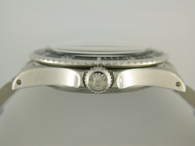 [/img]
[img]  [/img]
[img]  [/img]
Accrington Car Centre (although can't find a pic)
or
[img] ![]() [/img]
[/img]
far better than the official version.
because despite what some marketing people would have you believe, a logo isn't the be all and end all. Gucci, Louis Vouitton, Rolex - just a word - no logo.
Many people get very confused between what is a logo and what brand is.
Coca Cola have a logo. Their brand is not the logo, the logo is one tiny facet of their brand.
It is the same for every other major organisation, from Lidl to Lamborghini.
Re-reading the original question, we were also to explain [i]why[/i] weren't we.
The British Rail logo is my number 1 as it's become recognisable as 'trains' in this country.
Even though British Rail is a long defunct company, the double arrow logo is still used on roadsigns, tickets, on airport signage as the default logo of rail transport in the UK. It's as recognisably "railway" as the word "railway" itself, if not more so as even people that can't read will likely recognise it.
All that and it's basically 5 straight lines in flat colour.
My contemporaries and I believe that 'good design is what's left when nothing else can be taken away'. The BR logo is the very personification of that in my opinion.
I would die happy if in my professional life I design one logo even a fraction as good as it.
Found a good Guardian article actually:
It represents two tracks, heading in different directions, and crossed by stylised points. Ever since, it has symbolised not just British Rail or Inter-City (later InterCity without the hyphen), but the very notion of mainline rail travel. Not only has the logo been reinterpreted many times by railways bent on modernisation across the world, but in the era of gormlessly privatised railways at home, it remains the symbol for trains operated by companies of varying competence under the aegis of Network Rail.
http://www.guardian.co.uk/artanddesign/artblog/2006/dec/12/everydesignthebritishrail
[High 5s jackthedog]
🙂
jedi - Membercullen-bay, it is my fave
my mate came up with it for me
he said he made a logo that says it all about my cycling
I meant that it was a cheap advertising post.
because BMW was founded by the merging of two aero engine manufacturers and the roundel represents the spinning of an aircraft propellors against a blue sky.
An engine manufacturer and a propeller manufacturer actually. was at a tour of a bmw factory in munich less than 3 weeks ago...
[img]  [/img]
Just because 🙂 I like trac'urs and they are me fave 😉
and for advertising whoring...
[img] ![]() [/img]
[/img]
http://www.black2colour.com
Special STW discounts available 🙂 mail me!!!
[img] [/img]
The Gulf logo is my favourite. I sat in one of these when I was about 11 and it's one of those moments as a kid you never forget.
[img]  [/img]
Pembo, they could put the Poundstretcher logo on a GT40 and it would look good.
BMW:
"because Bavarian Motor Works was founded by the merging of two aero engine manufacturers and the roundel represents the spinning of an aircraft propellors against a blue sky."
Not really so. The colours of the Bavarian flag are blue & white chequers - also used by Lowenbrau etc, so that's why they picked those colours
[img] ![]() [/img]
[/img]
tee hee
