Aftertoon STW..
I was just having a browse through the BBC website, and came across this -
[url= http://www.bbc.co.uk/news/entertainment-arts-15577818 ]BBC Link - Clicky[/url]
Some of them are pretty decent, some not..
What do we recon?
Josh..
(Needs to take some Valium)
It's like, 'how can we make these Lympics even shitter than they are already, considering we've cocked up just about every aspect of it so far?'.
This is just taking the piss:
[img]  [/img]
Although I quite like these:
[img]  [/img]
[img]  [/img]
But this is just further evidence that Tracey Emin should never be allowed near any artist's materials, when there are so many other unknown artists out there with real talent:
[img]  [/img]
But tbh, they cooduv farmed the project out to an A-Level art class and got far better results.
Those posters are rubbish*.....
I was going to use a word that rhymes with rash & starts with g, but am genuinely not sure if that would be acceptable on here today (or any day for that matter), even though I use it all the time to mean 'rubbish'.
This one is good...
[img]  [/img]
I've been dealing this week with LOCOG and I've never come across such a load of cobblers in the name of 2 weeks of sport.
I wonder what all these clots are going to do once it's all done, and all the money has gone.
I quite like Rachel Whiteread's, but then again I am colourblind 😉
[img] 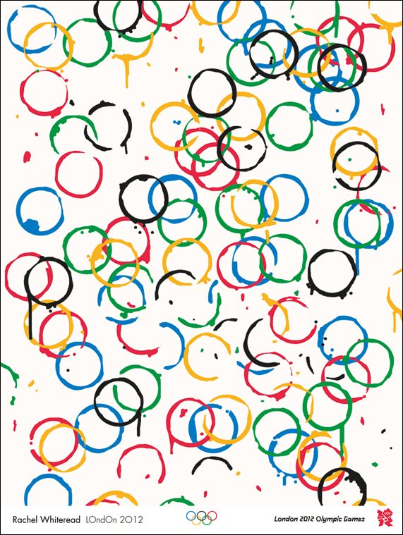 [/img]
The words ones good, not really representative mind, but good, so too the stopwatch and the other one with a stopwatch in it.
Rest are plop.
Perhaps this should lead to the subject for the next stw artists do art thread, 'design a poster for the London Olympics'...
Give me strength...
[img]  [/img]
I've seen better things on the fridge at my friends house done by their 2 year old.
the coffe rings one ^ is great.
the rest is shite.
I've seen better things on the fridge at my friends house done by their 2 year old.
Think they got that one covered as well hp 😉
[img]  [/img]
If there was only some way of combining something iconic about london and the olympics..... 😕
not strictly a poster, but something along these lines....
[img]  [/img]
Give me strength...
apparently, in that one the small black dot represents a tennis ball, and the large pinky one a wheelchair wheel.
Yeah, course it does. Right. Ok.
What a joke. And these people are being paid for such shit, are they?
(Wishes he was a famous artist and could earn thousands for doing very little indeed)
Riley, who began her career using only black and white patterns, started to experiment with colour in 1967, the same year she began painting stripes.
****ing luddite.....
quite un-inspiring posters, IMO
I quite like Rachel Whiteread's, but then again I am colourblind
See, when I did art at school, if someone had put a dirty coffee cup on the paper, I would have thrown it away and started again. Genius.
I like the cup-rings one too. Makes me think of what's left after a massive party, when everyone's gone home happy 😀
The blurb says there's a "figure" in that blue one, but I can just see what looks like a frog, or possibly a tortoise...
[img]  [/img]
[img] http://80.249.98.16/mhill/barney/images/grinch.jp g" target="_blank">http://80.249.98.16/mhill/barney/images/grinch.jp g"/> &sa=X&ei=qgq0TsLFENGq8APsk9yTBQ&ved=0CAwQ8wc4Nw&usg=AFQjCNES_ut0565Vu45dammTP1bSehHeHg[/img]
I think you're all being quite mean.
It was really sweet that the Olympic people let the local junior school do the colouring-in posters. And the toddlers will be really upset if they see the horrid things being said about their efforts.
I like the cup-rings one too. Makes me think of what's left after a massive party, when everyone's gone home happy
Actually that's a really good interpretation, and I can see that, which makes it kind of 'work', dun't it?
I think most of them are a complete crock of...
Actually that's a really good interpretation, and I can see that, which makes it kind of 'work', dun't it?
Haha! You like an art!
I'm not sure why we need posters? The olympics are pretty comprehensively sold out, and everyone has got to be aware they're going on.. Are the posters just to remind folk who couldn't get in, what they're missing out on?
Haha! You like an art!
😳
(Sidles off quietly)
Truth be told not a lot but on the upside at least some artists have had a short ride on the gravy train
Share the [s]love[/s] money
[img] [/img]
Has someone just screenshotted the commodore 64 loading screen there?
Very disappointing posters...I genuinely wanted to like them as I believe the games will be much better with public support behind it but once again it seems all style over substance: at the end of the day you should be able to glean from a poster what the hell it's advertising which some of those fail miserably
at 🙁
A couple of the Paralympic ones come across as really patronising with the love bit.
Its like saying you are sort of shit but i have so much sympathy with your predicament of having no legs and you look like you are trying so very hard and being so very brave going along on your wheelchair around the running track.
Are the posters just to remind folk who couldn't get in, what they're missing out on?
if the poster are anything to go by then those who didn't get a ticket aren't going to be too bothered....
Highly amused by the stereotypical 'art critic' on BBC News this morning, talking tosh about the toddler's blue swirly picture.
Couldn't the creatives at STW come up with a range of Olympic LOL Katz posters?
Couldn't the creatives at STW come up with a range of Olympic [s]LOL Katz[/s] posters?
...5 minutes later....
[img]  [/img]
I like Tracey's. The original was even better. Apparently it said:
"Even though I don't come first, I still like sex".
Elfinsafety - Member
(Needs to take some Valium)
It's like, 'how can we make these Lympics even shitter than they are already, considering we've cocked up just about every aspect of it so far?'.
Couldn't agree anymore if i tried.
Found this different angle but just has crap

I saw that art critic on the beeb - it is our fault for not looking at them long enough to understand them...he completely reinforced the idea that it is only art because a famous artist did it.
I think they're ****.
I saw that art critic on the beeb - it is our fault for not looking at them long enough to understand them...he completely reinforced the idea that it is only art because a famous artist did it.
What have I now go to pretend i am in an Art Gallery watching how the rings
all come together
Sounds like the Da Vinci code But finding the way to win medals LOL
it appears that the UK Olympic design brief is:
"Modern, Abstract and Challenging"
A great point was made on the Beeb earlier "did they know who the artists were prior to selecting the works?" It's a load of balls that they award these things to people on the basis of their "Pedigree" rather than merit of the finished product.
Bollocks to having hours to stand and stare to establish in inner meaning of a load of pics, the should be self explanatory, example being some guy hobbling into the job centre to get his benefit cheque then breaking the 100m record in his quest to get to witherspoons for opening time? Would show the UK in a more realistic light, would also help us re-in force the benefits well will all reap from this farce (spectacular event)
Edit: sorry, it could also be a woman hobbling into the job centre - to bring balance to my point
Just seems to be a large waste of money to be spent on something thats so temporary
Tracy emin boils my piss! She tossed something off in 5 minutes, and as good as said so. Even she's given up pretending it's not just more horse-cock nowadays! Some of the others aren't that bad to be honest. As pieces of art. As posters? Well ... They're not are they? They're paintings. Or in Emins case, a schoolboy-standard. doodle. Why not go the whole hog and draw a spunking cock and balls?
Here's an idea though. Why not get some of the worlds best graphic designers, who happen to be British, to do the posters. Or can we also presume you'll be getting the electritions to do the catering too?
Or in Emins case, a schoolboy-standard. doodle. Why not go the whole hog and draw a spunking cock and balls?
That made me laugh - it would go with the logo then... I still can't see "2012", only the "Lisa Simpson blowjob" 8)
1) Irrelevant
2) NICE
3) Meh
4) Paul Smith is consulting his lawyers
5) Chewbacca is consulting his lawyers
6) ATP are consulting their lawyers
7) Bertie Bassett is consulting his lawyers
8) zzzzz
9) Seriously?
10) ...
11) 'Seriously, they went for it? I was just ****ing about!'
12) That's what the BBC test card looked like during the Summer of Love.
A couple of the Paralympic ones come across as really patronising with the love bit.Its like saying you are sort of shit but i have so much sympathy with your predicament of having no legs and you look like you are trying so very hard and being so very brave going along on your wheelchair around the running track.
I agree, awful.
The cup rings one is the only one I really like as well. What a bunch of chancers - fair play to them if they can manage to get paid for this bollocks.
