UPDATE: Reviews section refreshed, redesigned, searchable: Go take a look
I doubt there were bribes, just people signing off the logo proposal who were stupid or just couldn't admit that they didn't agree with or get it but didn't want to look out of touch.
I preferred the Goatse version which somebody managed to get onto the BBC website:
[IMG]  [/IMG]
What I do like about it is that it hasn't TRIED to tell us it is in London and there will be medals and runners and stuff - everyone knows that already.
I suppose we could have had a logo of someone running in Pearly Queen clothing whilst jumping over the Tower Bridge just in case we needed reminding.
Oh don't be so silly, Winegums; is that the limit of your imagination when it comes to London?
Those splodges look like they took 5 minutes to do in MS Paint. Which is probbly your favourite programme so ner. 😛
[img] http://deco-00.slide.com/r/1/36/dl/kmiNCtw63D-Q-4HtFxYKr9xXcoCkosCX/watermarksm [/img]
I [i]genuinely[/i] want this. I mean, I know it's culturally insensitive, but I want it.
[img] 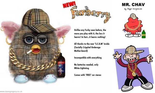 [/img]
And here's one with all it's fur tooken off. What a frightening thing it is. No wonder Emma is disturbed. 😯
[img]  [/img]
What I do like about it is that it hasn't TRIED to tell us it is in London and there will be medals and runners and stuff - everyone knows that already.
That is stupid marketing talk. Thanks for providing an example.
[i]There are children in Polynesian islands who wake up crying because the London Lympics branding is so bad[/i]
🙂
I see it now 🙂 Talk about slow!!!!! FFS!!!
Well done admiralable. Didn't think my Lisa Simpson giving a blowie moan would spark so much conversation. Most bestest thing I can still think to say is it's shit. as for furby's-skinning them doesn't stop them. I believe some have tried a microwave but still I think they survive. They are spawn of the devil.
I've worked in print and design for nearly forty years, and, while I don't really consider myself a designer, I know good design when I see it. And I certainly don't see it in the Lunnun 2012 'Lympic logo. It sucks. As Lisa's doing to Bart. The whole thing is just an immense embarrassment. The type design created for it is hideous, and has no redeeming features at all. Everything looks like an office junior sat down with a few sheets of graph paper and a set of felt markers. And to think we have some of the most creative design houses going in the UK. Shameful.
It is shameful. And it's a very interesting thread, Emma. Not least because it's introduced me (and possibly others) to the strange world of Furbies.
As for design; I'm just lowly small-fry compared some of the big design companies out there, but I love what I do, and have belief and pride in my own abilities. If that abomination really is the best a well-repected company like Wolff-Olins can come up with, then I despair, I really do.
It's seriously bad, and an abject failure. Even Winegums can't come up with owt to justify or defend it.
An example of good branding is Apple Computer. The iMac product range was the beginning of one of the most successful branding campaigns in recent times. An Apple product is instantly recognisable, distinct from it's competition, and there is a perception of quality and reliability about Apple stuff. The brand and logo has even become fashionable.
The London 2012 logo is the antithesis of good brand design. Supposedly designed to appeal to 'young people', it fails spectacularly on every level. A mate of mine was working with a youth project in east London, and some of the Lympic promotion bods came down to do some photo propaganda type stuff. The bought loads of t-shirts to give to the kids, to wear in the photos/
All the kids refused to wear them, because they were 'well butters' (crap). Says it all, really. 🙄
[img]  [/img]
