I'm trying to make some numbers for the front of my house and like the font on some I have seen on-line. I have looked through everything on word and cad and I cant find one the same. There are loads similar but not quite right.
I could also do with getting just an outline from that font so I can get the numbers laser cut in stainless steel.
I have access to cad and have drawn over a couple of fonts that are close which has worked well but are not the right one.
I need a 3 & 2
Thanks
Andy
[url= https://farm2.staticflickr.com/1474/26090934153_8565fc4ce2_b.jp g" target="_blank">https://farm2.staticflickr.com/1474/26090934153_8565fc4ce2_b.jp g"/> [/img][/url][url= https://flic.kr/p/FKyRJi ]number-three-LED-House-Numbers-size-H150MM-white-LED[/url] by [url= https://www.flickr.com/photos/andysredmini/ ]andysredmini[/url], on Flickr
Off the top of my head - Geometric?
I'll take a closer look...
I thought Avant Garde but it ain't that.
Here's Gemotric 706 which was my first thought. It's not exactly right though. It doesn't have that narrowing at the juncture.
The only other ones I've found (and I'm surprised) are:
P22 Johnston Underground
http://myfonts.us/td-WpiJEY
Museo Sans
http://myfonts.us/td-3Xp97E
(this does have that narrowing).
I could modify these to be closer - the '2' isn't quite as unique, so that probably doesn't need touching.
Thanks for the info so far. Ill have a proper look when I get home from work
I have forgotten how complex fonts are.
Here is a link to some more examples from where I got the original picture.
http://www.aliexpress.com/item/LED-House-Numbers-and-letters-Apartment-LED-Numbers-and-letters-size-H250mm/32380491755.html?spm=2114.40010508.4.34.zahIy2
hmmm - the '1's look nothing like any of the 3 fonts I linked to.
Here are the rest of the numbers from that link:
[img]  [/img]
[img] 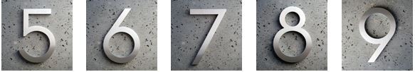 [/img]
I kept coming back to it and looking again, knowing that I know it and what I *think* it might be is the London Underground font. Maybe?
[img]  [/img]
https://en.wikipedia.org/wiki/Johnston_(typeface)
EDIT: It isn't quite that (there isn't the slight upturnat the inside edge of the underneath of the top stroke) but it is very similar.
[img] 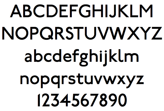 [/img]
However other numerals (such as the '1' an '6') are way off
It also looks a bit like early Hollywood film posters type style - which is probably why I initially went with Avant Garde - it's that sort of period (as in the art movement, not when the typeface of the same name was designed - that was much later).
(a free version of Johnston is https://www.fontsquirrel.com/fonts/railway, but it's not a match for the other numerals)
They look so familiar, but...
Im half thinking of just drawing over the pictures in cad and using that. I should be able to get it close enough.
Futura.

The 8 isn't bang on, other weights available may match better.
I have this as a truetype at work so can oblige with the outlines if required.
I thought Futura when I saw the other numerals, but the 3 isn't anything like it.
I can draw over those signs in Illistrator and export as a dxf if you like. Let me know. Email in profile.
Yeah the 3 in Futura is a million miles away and all the others are similar at best.
Thanks very much for the help and the offer to over draw the pics.
I had a go at overdrawing the pics on cad this morning and I now have the outline below which I think will be fine.
[url= https://farm2.staticflickr.com/1704/26710252915_6691d8cdbb_o.jp g" target="_blank">https://farm2.staticflickr.com/1704/26710252915_6691d8cdbb_o.jp g"/> [/img][/url][url= https://flic.kr/p/GGi2BZ ]32[/url] by [url= https://www.flickr.com/photos/andysredmini/ ]andysredmini[/url], on Flickr
Here's what it will look like on the house. The panels either side of the door are nice brickwork and the rectangles above the numbers are stainless up/down lights. I think the numbers should be slightly smaller but the wife insists and has a good eye for this sort of stuff.
[url= https://farm2.staticflickr.com/1719/26437740370_1128e44c47_o.jp g" target="_blank">https://farm2.staticflickr.com/1719/26437740370_1128e44c47_o.jp g"/> [/img][/url][url= https://flic.kr/p/Ghdk8Q ]32a[/url] by [url= https://www.flickr.com/photos/andysredmini/ ]andysredmini[/url], on Flickr
Next to work out how to back-light them. Maybe some of that led tape.
Thanks again
Andy
If you can get the font in cad, you can explode it to lines/arcs etc, for the exact match if you want...
edit: the command is txtexp
Next to work out how to back-light them. Maybe some of that led tape.
EL wire perhaps?
I haven't been able to find the exact font. close but not quite right and when I do explode them they are really jagged.
I had a brief look at the EL wire but the ones I have seen probably wouldn't be bright enough. I'm happy to be educated though.
At the moment im thinking of cutting out the numbers in opal acrylic and hollowing out the inside. stick some led tape to the back of the number inside the hollow part of acrylic and fix the whole lot to the wall with some stainless standoffs.
[url= https://farm2.staticflickr.com/1647/26617942212_44a3be09c9_o.jp g" target="_blank">https://farm2.staticflickr.com/1647/26617942212_44a3be09c9_o.jp g"/> [/img][/url][url= https://flic.kr/p/Gy8US9 ]7[/url] by [url= https://www.flickr.com/photos/andysredmini/ ]andysredmini[/url], on Flickr
[url= https://farm2.staticflickr.com/1481/26104917164_2408345676_o.jp g" target="_blank">https://farm2.staticflickr.com/1481/26104917164_2408345676_o.jp g"/> [/img][/url][url= https://flic.kr/p/FLNwoG ]42[/url] by [url= https://www.flickr.com/photos/andysredmini/ ]andysredmini[/url], on Flickr
I agree with you in that the numbers look about 10/15% too big for that positioning.
Just be a little careful with placing the letters in relation to each other.
Here's a screengrab of a similar font (Geometric 716) showing how the 3 sits lower than the 2.
[img]  [/img]
It definitely looks a little uncomfortable in those images you put above.
Funny you should say that. I thought they looked a bit wrong and found they looked better when the 3 is dropped a few mm lower than the 2. Thanks for confirming its acceptable.
I do explode them they are really jagged.
Do you mean when you zoom in, the edges of the characters are jagged? If so, find an online freebie vector map conversion tool. Jagged jpeg in, baby's bum smooth vector map out.
Funny you should say that. I thought they looked a bit wrong and found they looked better when the 3 is dropped a few mm lower than the 2. Thanks for confirming its acceptable.
That's how fonts are designed. The bottom and top of any curved part of a character will [i]always[/i] go slightly above and below a horizontal along the top and bottom of the flat part of a character. Fonts are measured by the X-height, usually the caps. If an 'O' or a zero is sat on the base-line, it'll stand well above the X-height and look very odd.
I've spent many, many hours redrawing type in logos where the original font wasn't available, either in CorelDraw or Illustrator, and I got really good at placing node points and then dragging the little 'handles' on the node to get the curves right.
Part of my then job I found immensely satisfying.
That font is really nagging at me, I really ought to know what it is, but I no longer have access to a comprehensive font library to refer to, usually known as a Letraset catalogue!
If you have the font, in illustrator it's dead easy to just go 'convert to curves', which gives a vector file, which a CAD system ought to be able to use. If the vector is ragged, then it's because the outline has been created from a bitmap original, and has replicated the jags you can see when a raster or bitmap is enlarged; if that's all that available, then the largest image available should be used, at the highest resolution, which should give a smoother line.
I'd use a cheap or free vector drawing package and redraw over the top of the bitmap numbers if it were me, there are a few out there, some in iOS.
Bored at work waiting for reports to run so had a quick look. The font looks very similar to Neutraface (the 1 especially).
http://www.houseind.com/fonts/neutraface/viewfonts
lankystreakofpee - That does look like a good fit!
Annoyingly, I have the font, but only in thin 🙁
Is there some kind of "Best Door Number On A House" competition that I've missed? 😯
Draw them from scratch?
I cut masks for repainting lettering and almost
always end up drawing the lettering out myself.
I use adobe illustrator, which doesn't take a lot
of learning to use, but guess inkscape would be
similar[and it's free].
DezB. I saw one I liked and enjoy making things. What's your problem?
Why is there always one idiot?
To everyone else.
Thanks for that explanation of fonts count zero. It really is amazing how complex they are when you start looking at the details.
Lanky. Good find thanks. That looks like the one. Especially the bold one. Now how do I go about getting my hands on a 3 & 2 without paying hundreds of dollars?
So sorry Mr Anal, maybe you can draw up a sense of humour on your CAD system one day.
You put the wrong smiley if you wanted sense of humour.
I will have a play later and send you some dxf files.
I'm pretty sure I can get something from the font variants I have with a bit of jiggery pokery.
Thanks Alex that would be fantastic. My email address is andysredmini at hotmail dot com.
There is an app called "What the Font" that is usually quite accurate.
Sent via email.
PDF here for anyone else interested:
Thanks again for everyone's help. I got the blanks back from the laser cutters a couple of days ago and sent them for polishing/ brushing. They are not quite finished on the pic below but they are looking good. I have decided for now to not bother back lighting them as I have enough jobs to do and this isn't that high up on the priority list. I'm a bit annoyed as the laser company used the first drawings I sent them and not the revised smoother looking font Alex kindly produced for me.
They haven't charged me for cutting them so I cant complain too much and I think they look good either way.
I have bought some stainless stand-offs (disregard the top part) and have tapped the rear of the numbers to accept an m8 bolt which I will insert and locktite in place. I will then loosely screw the stand-offs to the brickwork (based on a template) and then hopefully align the bolts to the threaded stand-offs and tighten them up. That's the plan anyway. More pics when they are finished.
Andy
[url= https://farm8.staticflickr.com/7077/26525048324_865908721d_h.jp g" target="_blank">https://farm8.staticflickr.com/7077/26525048324_865908721d_h.jp g"/> [/img][/url][url= https://flic.kr/p/GpVNKo ]Untitled[/url] by [url= https://www.flickr.com/photos/andysredmini/ ]andysredmini[/url], on Flickr
[url= https://farm8.staticflickr.com/7744/27097722386_92c1bb0726_h.jp g" target="_blank">https://farm8.staticflickr.com/7744/27097722386_92c1bb0726_h.jp g"/> [/img][/url][url= https://flic.kr/p/HhwUN7 ]standoff[/url] by [url= https://www.flickr.com/photos/andysredmini/ ]andysredmini[/url], on Flickr
