The Pole evolink, just ugly and cheap looking frame, like those full sussers in the Argos catalogue.😃
The new marin mount vision looks hideous.
Any folding bike with tiny wheels. Bromptons, Terns, the lot.
My Genesis CDF with Jones loop bars (actually Planet X knock offs), looks plain wrong. We call it The Zimmerbike. However it's such a pleasure to ride it just keeps coming out for adventures.
Any orange FS
[img]  [/img]
I'll add pretty much anything from the long/low/slack school of thought. Might ride well but it looks hideous, like the bike has been placed in a clamp and someone has grabbed the front hub and pulled forwards and upwards.

For modern day era it's got to be Polygon xquarone, it's just hideous.
Haibike, any, just take your pick.
Most cannondale full suspension.
Yeah, that pole evolink is an eyesore.
Anything that has RSF aspirations, fatbikes and anything Cove ever made.
All rank.
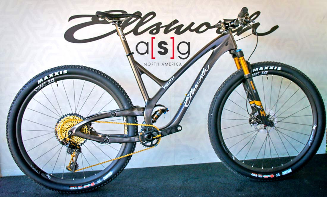
Inevitable Ellsworth
[img]  [/img]

Ceepo Shadow R ****ing ugly
The Ceepo above, and every other fugly tri bike.
Inevitable Ellsworth
Yeah, came here to say Ellsworth.
Absolutely zero aesthetic consideration. Well, maybe they slightly considered the front end, but then got bored and just used a load of discarded farm machinery for the back end.
Don't know how they ever got off a drawing board, never mind any being sold 😳
Any road bike where the ride position is set up more like a mountain bike - high bar position with spacers under the stem (sometimes a stem with 20 or more degrees positive rise too), sometimes toe clips for good measure. Hoods rotated too much towards the rider (extreme amount), and saddle too high or too low. Although that’s not a specific bike, I know....
Tbh I’d say that’s a high percentage of road bikes on a sunny weekend , but some are awful.
Anything by Corratec:

Most cannondale full suspension
I would think a lot of people would disagree, especially with the new Scalpel.
Scott have made some great bikes, and contenders on the other thread, but this one was all kinds of wrong...
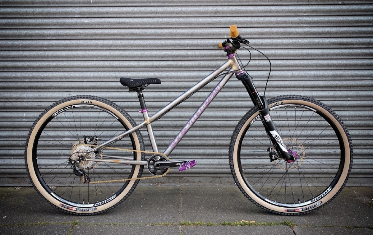
That sick hello dave xl bike in the classifieds 🤒🤮
How you make a black hardtail frame ugly is beyond me.
kayak23
Inevitable Ellsworth
Yeah, came here to say Ellsworth.
Absolutely zero aesthetic consideration. Well, maybe they slightly considered the front end, but then got bored and just used a load of discarded farm machinery for the back end
Especially as the it was originally discarded for being to ugly!!
Seems the FX DH was too ugly to let me post a working pic of it.
Take you pick. I mean it's difficult to decide which iteration of the Raven was most visually challenged- disk (Coda, of course) or vee, Headshock or Lefty, Black or coloured. This particular example, tricked out with Spinergy wheels, isn't too bad by Raven standards, but unfortunately lacks the top tube bottle cage necessary for completeness.
Any Orange bike in existence
Any bike with white tyres.
And Poles. Look like someone’s attached a hook to the bb and front axle and pulled them apart, to the point of almost but not quite snapping. That job being for the rider, obvs.
Ah beaten to the Elsworth photo. Are they still going? That being said Kona's of a similar vintage with that massive top link because they didn't want to pay the licensing cost for Horst link.

Are they still going?
Think so, they’re into making carbon bikes that look like they’re melting now iirc.
After adjusting to modern bikes, old bikes look odd. I remember when I first set eyes on a ragley. It stung my eyes.
fat bikes also look ok once your accustomed and it takes me most of the summer to get used to looking down on a 2.5 tyre rather than a 4.8.
I don’t think I’ve ever seen a full suspension bike that looked good.
Can we have a few current or more recent bikes that look odd please? Let’s just take it as a given that a lot of full sus bikes pre 2002 ish look odd, or wrong.
I’ve never liked the look of Cubes myself. Just a bit tacky and cheap.
Any of the 2018 Lapierre Full suss bikes with the arching up top tube, they all look broken when new. Demo'd a Spicy which rode well but just couldn't get past the looks of the thing.
It was to replace a 5 so that kind of indicates how low down looks were in the priority list!
I’ve never liked the look of Cubes myself. Just a bit tacky and cheap.
Cube get pelters on the internet. The ones before 2015 were absolutely awful looking. The 2015 alloys were a bit marmite and some of the paint jobs were defintilty a bit teenage boy bad day at Halfords.
Dunno though I reckon the carbon 140's and 150's from 2018 on look pretty good, even the alloy Fritzz and similar Stereo 140's look alright in the smaller sizes. Feel free to disagree of course!


A lot worse get's posted on this forum!
I knew someone would post a picture of the Whyte PRST1. I get they look shorthighsteep now, but at the time, and even now, I thought/think they look great.
Anyway, which was the one that looked like a dog having a poo? Mojo?
[img] 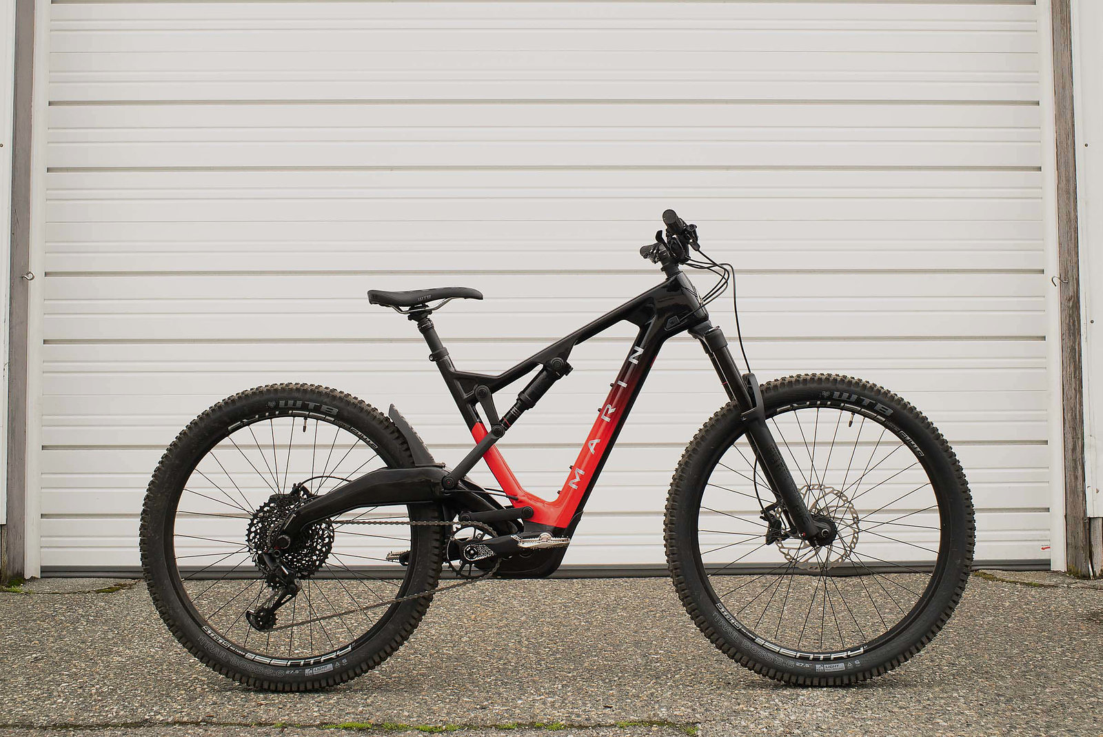 [/img]
Knew they'd be some Orange bashing going on 😀
I love em, simplicity at its best, no fuss. That said early 26ers looked odd in larger frames had weird proportions.
I agree the paintjobs on Cubes have improved, but the shape just doesn’t do it for me.
Ibis Bow ti, my one vote for an older fs bike that looks wrong.... google image search as I haven’t figured out how to attach yet 😳🙄
Exactly them Marins (above) and Polygons have all the worst attributes of Ebikes, combined with looking pre-snapped and a bodge job has been done on the linkage.
Suspension was supposed to be good LOL according to them! It'd have to be looking a dogs dinner like that. Unfortunately testers/reviewers didn't agree and they were toe-bunged into the bargain bin.
