Cougar.
Not able to change username, it’s greyed out.
Oh yeah, so it is.
Reporting, sorry if it’s been done, but I’ve just tried to add a website link into a forum post, the Link button pops up the window but there’s no text in it. Trial and error trying to add the correct bits in the correct boxes.
iPhone running Safari on iOS 14.8.1 was OK before the update to the forum.
I think that's a dark theme issue - the text is there, it's just white on a white background. You can see it if you drag-highlight the background (how you do that on an iDevice I don't know).
Light theme may be similarly affected, I haven't checked and don't care sufficiently to test it.
That’s a contentious one. When we launched it wasn’t fixed. There were a lot of voices asking for it back to help with navigation
I still 'long' for the Overview button we used to have at the bottom of the thread text.
Simple. Perfect.
I wonder why it went nearly every time I reach my right hand right across the screen I'm viewing to the top left corner to open a menu, then reach across to the bottom left to hit Forum, which is, you know, a hundred times.
I'm always confused as to why I seem to be the only one around here who finds that unnecessarily convoluted and ergonomically unsettling 🤔
Most seem to hit the back button, which doesn't take you to a refreshed overview but a cached one, or happily scroll all the way up every time, fingers like a cartoon character starting a dash 😂
But yeah, at least there is a burger menu now, albeit in an unintuitive place. It used to be accessed on the right which at least meant that you weren't reaching across the screen (if you hold your device in your left hand) but now it's disappeared and gone to the left.
Funny old world.
I still ‘long’ for the Overview button we used to have at the bottom of the thread text.
Simple. Perfect.
Me too.would love to know why it went
Me too.would love to know why it went
I imagine it's because they want you to see that there are other places to navigate to other than just the forum each time you move.
Fair enough, but still annoying 😐
The previous version forum used to let you know you had a DM on the front page, but with this new one you have to specifcally go into the your profile to see if there are any messages. Maybe the little 'my account' symbol at the tp could get a small red dot or something if you have unread messages??
I'm with Kayak23 on the link straght back to forum overview from the bottom of the thread. There was at one point a "back to top" button that hoverred on the thread page, but that also went.
It does feel like a deliberate attempt to make the forum harder to use.
Also, teh "Classifieds" link from teh hamburger menu is off teh bottom of teh page on my mobile - effectively hiding teh classifieds from view, so if you are not familiar/aware of them already, you'd never know they existed. Given that teh classifieds has been recently monetised (thought boosted ads), I'd have thought SWT would want to have this more obvious?
Simply putting the bold/green links in the hamburger menu at the top of teh list (rather than the bottom) would make both these situations better.
I would guess - and it is a guess - that these are customisations which get overwritten when a new theme is installed. Ie rather than something being intentionally removed it just hasn't been reimplemented yet.
. Ie rather than something being intentionally removed it just hasn’t been reimplemented yet.
Not sure. I mean it's been several years I think since the Overview button that used to be at the bottom of a thread went missing after an update. I've been moaning about it ever since! 😂
Since then we've only been able to navigate back to Overview by opening the floating banner hamburger menu, which opened a side banner with a speech bubble symbol which you tapped to take you to overview.
Or, clearly what a lot of people do, hit back and get a cached page or scroll all the way back to the top to get the overview button.
Feels intentional to me, but Mark or anyone else never comments on it.
Obviously it's not the end of the world, but why not have something incredibly easy to implement that makes navigation so much easier?
Don't know...
Nor I.
One thing I think is great on another forum I use, is a button that takes you to the last post you read on a thread. I have no idea how easy/costly this is to implement, cracking feature though. Can you even get to the last post in a thread yet on here?
Those Spline Texts are now ALL popping up on a screen refresh of the forum contents list. They flash up, then disappear leaving only one. As a result the screen contents are jumping around.
Agreed this is painful. They're animated by some javascript that runs after the page loads. Developer needs to run the site with javascript switched off, and put some CSS on the block that makes it the same height as it would be once the script has run.
FYI I'm getting an (unobtrusive) advert - below the big white posting box I'm writing in and above the Facebook/Twitter etc links.
It's a banner advert for <scrolls down a bit> Ezoic and ironically is suggesting how to "Increase your site revenue". Maybe we should all click on it? 💩
That's just the provider we use for our ad system. It's a static image. We get a commission if anyone signs their website up to them 🙂
ahhh adds for people paying to remove the adds. great.
Dark mode only available on mobile for me. on chrome the site is definitely white?
ahhh adds for people paying to remove the adds. great.
Ahh, come on now - it's tiny, unanimated and I'm not even sure how long it's been there for it's that unnoticeable. Give them a pass on this, surely 🙂
Andy doesn't give passes. Not to us anyway
Survey thread broken. Can't read page two.
Is there a search? I can't seem to find it.
Andy doesn’t give passes. Not to us anyway
Yup no one gets a pass im afraid. You know those really evil grumpy old bastards, thats me 🙂
Honestly, it's a sh1t show. It's awful.
I get the Privacy & Transparency menu pop up on almost every new page which just makes the site unbearable.
Also, you claim to have opened up the review section to everyone... you haven't, or at lest not me.
I find I'm spending less and less time on the site.
Is anyone else finding that? Add that to your poll section.
I get the Privacy & Transparency menu pop up on almost every new page which just makes the site unbearable.
So what are you doing differently from everyone else who doesn't?
@Cougar. No idea. I’ll try other browsers and get back to you.
That was going to be my next question.
It has to be some sort of incompatibility between the site and your setup, a browser setting or a plug-in or something. Otherwise everyone would be having the same issues.
And before the usual suspects pipe up, I'm not suggesting that it's your fault. But there must be something on your client which is interfering with the site's operation.
Normally I'm one of those that also comes on here saying it works fine too.
This time I get the Privacy pop-up on every single page when logged out, but didn't when logged in.
And that privacy page does not allow one to manage cookie settings, and only allows one to accept recommended settings. I normally reject all "non-essential" cookies.
Only started doing that very late last night for me, so not had time to investigate why the site and my settings are not compatible.
Brave browser on Android, and Brave browser on Linux. JS is enabled. Don't recall any specific things blocked on STW, but will investigate later.
I get the privacy pop up on every page translation now. Nothing unusual here, iPad 11 Pro running iPadOS 15.6.8, standard Safari browser with no extensions or blockers. This is the sort of thing the site should work perfectly on.
Edit…. Probably related to this. And no, I’m not turning tracking back on.
Edit…. Probably related to this. And no, I’m not turning tracking back on.
If you're blocking the cookie used by the third-party privacy plugin then it's not possible for it to remember that you've submitted your choice. Whether that's related to you blocking "tracking" I don't know but it's plausible. Perhaps you can whitelist whichever one it needs, but that's a question for Mark (and someone who knows anything about iPhones).
I had a theory a while back, Safari does something fruity with cookies like "block cross-site cookies" or some such. I wondered if that might be related, but again I'm just guessing and I have no means of playing with it.
Either way. I've reported the issue for you.
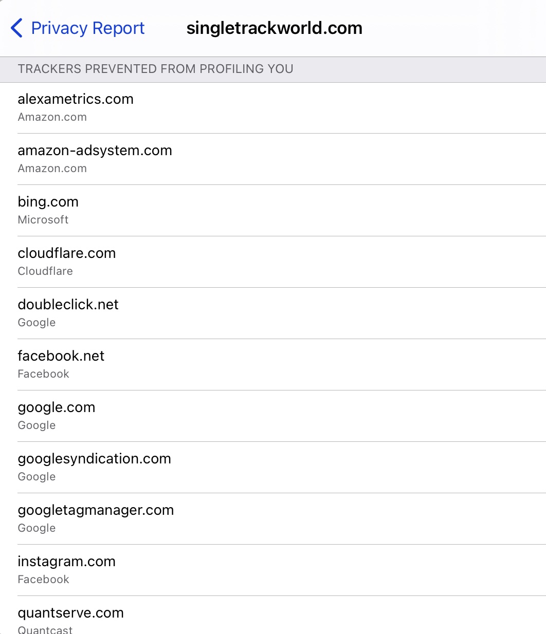
The quantserve.com cookie may well be linked to consent. If the CMP (Consent Management Platform) can't log a cookie on your device because it's being blocked then it will not be able to detect you have already consented. But I'm pretty sure that our CMP uses a 1st party cookie ie. one of ours attached to the domain singletrackworld.com. If your device blocks our cookies then you will get the consent popup every time because your consent is a legal requisite. If singletrackworld.com is on that blocked list then that will be the cause of the issue.
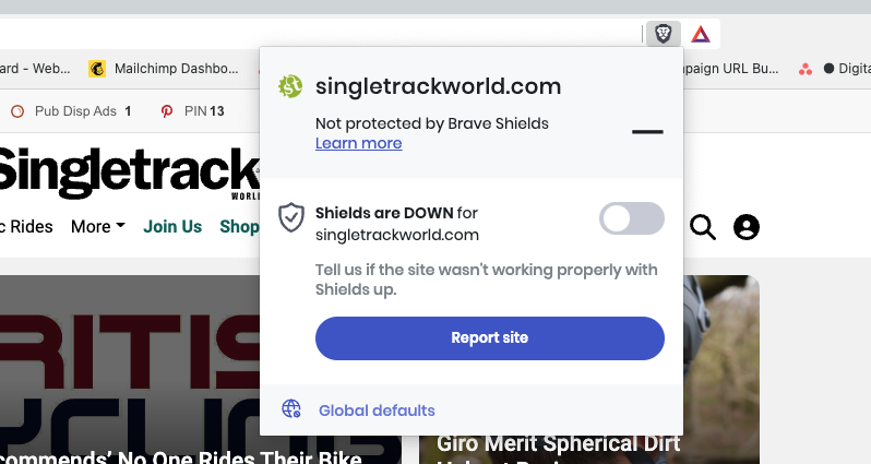
Brave on desktop has this control. You need to 'drop shields' for Singletrack in order that the CMP cookie can be set to your consent preference.
This is my entire screen, with the browser full-screened, before I login:

I'm logged in now and as a paid member it's fine (after I reluctantly disabled uBlock to access the cookie menu) - but I fear the very ad-heavy experience might struggle to convert casual browsers to registered members?
There's 40% fewer ads on the new theme. 70% of users view the site on mobile and tablet and the average desktop resolution is a fair bit higher that yours it appears. Not discounting your experience at all, but it's easy to think that the way we see the site ourselves is how most see it. The vast majority of our visitors use a phone.
Thanks for looking into it.
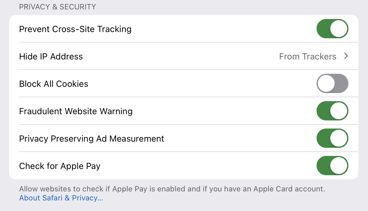
For reference, here’s my privacy settings from Safari. The “Prevent Cross-site Tracking” blocks all third party cookies, but I allow first party ones. Pretty sure this is what Safari on iOS and iPadOS defaults to.
Ahh I'm on brave, you want me to drop shields? Hmm.
I would presume that once the cookie has been set you can put it back as it was?
Ahh I’m on brave, you want me to drop shields? Hmm.
It's entirely up to you and how you set up your preferred browser but if you choose settings that stop the consent cookie from being set on your device then the CMP is going to appear on every page. FYI it's an industry standard CMP - it's not our software but we do set it on our own domain to allow people who choose to refuse 3rd party cookies to be able to register their consent.
Hi Mark,
Are you sure it’s working properly and nothings changed? There’s been at least 2 new threads on this exact topic in the last day or so, I’m getting the same problem both on my iPhone and Chrome on Windows laptop. Yes both are running adblockers, but these aren’t new.
Tom
FYI it’s an industry standard CMP – it’s not our software but we do set it on our own domain to allow people who choose to refuse 3rd party cookies to be able to register their consent.
Nope I only get this issue here,same settings everywhere I go on the net and STW is the only place that asks me for cookies every page.
I have to click "continue with recommended cookies" every page and if I click the settings icon the page just hangs. It would be nice if you could sort it. 🙂
It started yesterday.
Tech guys here are looking into this now.
it’s an industry standard CMP
Well it only affects this site, so not sure you are correct here
[URL= https://thumbsnap.com/t/yvokZ87n.jp g" target="_blank">https://thumbsnap.com/t/yvokZ87n.jp g"/> [/IMG][/URL]
For reference, this is a screenshot on a laptop with as blockers disabled. Screen resolution is 3840x2160 (4k) so its not a low resolution like you said about the previous screenshot.
I would presume that once the cookie has been set you can put it back as it was?
Seems to work with FF desktop and <spoiler>REDACTED</spoiler>.
And disabling then reenabling privacy protection on DuckDuckgGo mobile browser works too. Thanks!
No idea if it's been said yet but your big floating Google ad at the bottom is cutting the bottom of the hamburger menu where the link to the classifieds presumably lives.
Once again, can we please have the option of just closing it after it has loaded? You still get your impression and we get our screen space back and access to the classifieds.
