gravitysucks, if you're going to go that far I believe a whale is obligatory.
seosamh77 has done pretty much what I was getting at, at the bottom of my first post.....that would have been my first attempt at a tinker with it.
mmm good point camo, although do you know whats better than a whale.....
[IMG] 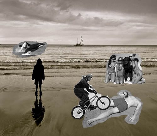 [/IMG]
[IMG] 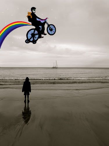 [/IMG]
A killer whale! Genius.
When the student is ready, the master appears.
[IMG]  [/IMG]
gravitysucks, let's talk balance.
Aerial attack, methinks?
This post is not a post. It's a pseudo post. Ignore it. All it wants is attention.
I'm afraid this will be my last attempt, i'm afraid I went too far and may spoil it....
Aerial attack you say..
[IMG]  [/IMG]
I'm afraid this will be my last attempt, i'm afraid I went too far and may go to far and spoil it....Aerial attack you say..
😀
A very quick play - can't decide whether it is better with or without the boat....
[img]  [/img]
Probably would be better with a lower angle so the head bisects the horizon line and the viewer feels they are looking through the subject and at what the subject is looking at?
"[i]I think you should have asked the model to close their legs a little and fold their arms. They look somewhat uncomfortable (literally and in terms of the composition) and plonked in the image. As they are the emotional centre of the photograph, this discomfort colours the entire image (for me).[/i]"
As you said, your opinion.... but mine is the opposite. It's a natural pose, it's not uncomfortable-looking (I think folded arms would be, especially in near-silhouette from the rear), and it's also clearly - partly due to the pose - a child, which I think adds to the 'staring out into big space' theme.
.
it looks under exposed which leaves it very grainy
and the main focus is too dark agianst the background making it look like a flat cut out (very arty and atmosperic and all that) looks as if it has been drawn in. As for artistic merit of the composition, if you like it.
[img]  [/img]
I like the pic and the choice to convert to black and white works really well.
You could almost do with slightly worse weather which gives rise to rougher seas and angrier skies, but there's not a lot you could do about that! A shot like that also works well from a clifftop or rocky outcrop as it can also add a bit more forecround interest.
Using an ND grad would have helped bring out detail in the sky by balancing the exposure, but you can add it in most editing software. YOu could also have used a bit of fill flash to pick out a bit of detain in your son, but that depends on what you were going for with the silhouette. Experimenting with crops can also change how a picture feels too.
At the end of the day, photography is a personal thing and all that matters is that you enjoy your pictures, what the rest of us think is only our opinion in the end!
Anyone like my picture?
[img]  [/img]
You need a dog in the picture.....
[img]  ?zz=1[/img]
My effort fwiw...
[img]  [/img]
The first version of the picture you posted is my favourite. It is not because of the balance/positioning/light levels and all the other good stuff, just that it provoked thought. It made me think who, what, why etc. I didn't see it as a personal picture of a family member, more of the moment/scenario. Suppose it is all down to interpretation and what you want the picture for.
What's wrong with my pikture?
Your printer has run out of coloured ink, innit?
I love the original.. and I'd have shaved a bit off the right hand edge, like seosamh77. Perhaps wouldnt' have fiddled with the contrast as much. I love how bleak it looks, that's how things really are on a grey cold seaside day.
Good work OP. I like it because it's quirky like some kind of minimalist surrealism but it's a real picutre.
I think you could alter it for the better by cropping it, but otherwise as said before - a shame where the wave is breaking relative to your lad's position. If it was just above his head, that'd make it a nicer image IMO.
If you want a busy pictrure you just have to pick the right bit of water...
[IMG]  [/IMG]
(taken on phone so rubbish really)
[url= http://farm7.static.flickr.com/6067/6097799586_4864d9e46c_z.jp g" target="_blank">
[url= http://www.flickr.com/photos/stuartie_c/6097799586/ ]stuart's attempt[/url] by [url= http://www.flickr.com/people/stuartie_c/ ]geoffj[/url], on Flickr
Bit crude. New layer for the sky, adjust the levels and tweak hue and saturation = lots of noise...
