UPDATE: Reviews section refreshed, redesigned, searchable: Go take a look
Hi all. As you may have noticed, we have launched an updated look and design for the site. Here is a place to submit your feedback on this.
[forminator_form id="12516949"]
Having an issue where the fist time I click on any thread a blank screen is displayed, come out and back in and thread contents then appear. Chrome browser on Windows 10 PC.
I’ll complete the form later when I’ve had a better look. My first impression is I dislike the topic list spacing because you have to scroll for ages to find the thread/s you’re looking for. Much preferred the precious formatting across a single line.
There's a dark mode?
How do I geta dark mode?
First impressions look good! Dark mode is great.
To change go to
My account > preferences
Dunno about desktop but on Android it follows the phone theme - phone set to dark mode and so is the website. Same for light mode.
First impressions look good! Dark mode is great.
To change go to
My account > preferences
There's an option to disable dark mode but there's not one to enable it
I've had dark mode here for years! Probably a Mac thing 😎 😂
(the REPLY | REPORT buttons aren't quite compatible now though... they appear as black on dark grey so difficult to see. All the other colours are fine though)
Dark mode toggle doesn't work :/
Dark mode on or off doesn't change anything for me (viewing in Chrome).
Profile button doesn't work when viewing a forum thread (e.g. now).
Filled in the feedback form about not being able to access My Account drop down menu from within a topic. ie. I can't use the directions given above to switch to Dark Mode from here, I have to go back to the Overview list before it works.
Using Chrome OS 104
What areas of the site do you think require more improvements
Other:
The Search! It's soooo bad!
I reported the same andy5390.
Is the ezoic banner in the footer supposed to be there?
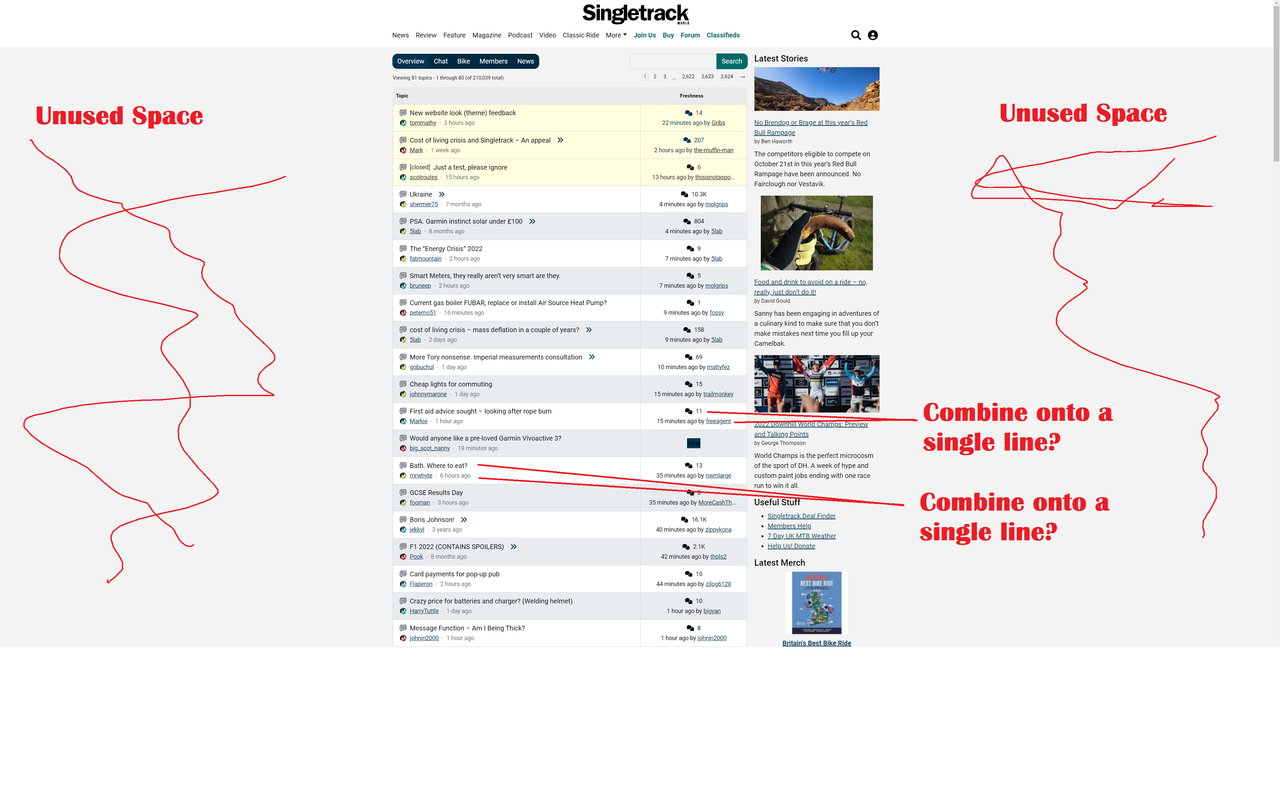
It feels like it's designed to be used in portrait rather than landscape with excessive boarders on either side on a normal monitor. The content I actually want uses less than half the screen and the latest stories column is far to obtrusive.
Windows 10 & Chrome, default view when I logged on this morning. Nothing too shocking but could use the screen real-estate better.
The thing I don't like from a function POV is from the forum overview page you have the two columns - forums threads, and latest stories. You can't independently scroll down the latest stories. When you've scrolled down two thirds of the forum threads the latest stories join in, but you have no independent control. Chrome, W10
Dark mode is great.
To change go to
My account > preferences
There’s an option to disable dark mode but there’s not one to enable it
Same issue here - cvan only select to disable it. (Win11, Firefox)
Windows 10 & Chrome, default view when I logged on this morning.
This is what I get Chrome/Chromebook
Edit: Page zoom set at 125%

We used to have a "jump to latest message in a thread" link next to each post. I found it really useful and it'd be good if that could be added back please.
Hi guys.
sometimes moving from Bikes to Chat, (and vice versa) I get a blank page, hitting the refresh loads it.
Forum usability has taken another big hit hasn’t it. The overview is very busy and each topic links to the topic creator’s profile which I don’t need in the overview, the last posters profile which I don’t need in the overview but no link to the latest post, the latest that I haven’t read or even any indication that there are entries I have or haven’t read.
I really can’t decide whether it is intention, ignorance or that my use is totally different to everyone else?
Contrary to everyone else, I actually much prefer the new forum look. While the old one was great for loads of threads in a small space, I found it really hard to find one and often scrolled past. The new one is much easier to read, especially on a laptop screen.
Can we get a 'spreadsheet' view? So it looks like Excel?
well it hasn't crashed the browser on my work PC yet so that's one thing that's better.
Just released a minor update:
- Fixed link colour under replies in dark mode
- Fixed the user profile icon not working when in a topic
- Fixed images in the shop when hovering over them to stop them going "full disco" mode
- Fixed various other non visual stuff
- Added a logout button
Right now we are monitoring the site and gathering feedback. We will review the feedback next week and incorporate that into our releases going forward.
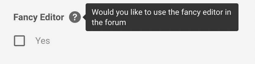
I'm neutral about the changes. I tried updating prefeerence for "Dark mode" but no joy
However i was suprised to see a check box for "Fancy Editor" which I thought was frankly non of your business.
Then i worked it out
@worldclassaccident The problem with ultra-wide screens is either excess space on either side, as you've identified.
Or an unreadable forum with 7.8 bazillion (real number) words per line.
Agree it looks odd to you. That's why most sites use that blank space to peddle (see what I did there?) ads for shit that no-one wants.
Possible bug -
Forum search doesn't appear at the overview level (but it does once you've picked bike/chat/etc)
Agree it looks odd to you. That’s why most sites use that blank space to peddle (see what I did there?) ads for shit that no-one wants.
Other forums don't - the screen seems to adapt to whatever device you're using
(check pinkbike forum for example)
I'm not bothered, personally, just saying WCA's not wrong.
The problem with ultra-wide screens is either excess space on either side, as you’ve identified.
It's a problem on a standard 16:10 monitor. Actual content using about 2/5 of the screen. It's like they've copied pink bikes btl comments rather than using normal forum layouts.
Woohoo! The Logout button is back for me.
All good on my end 🙂
How do I enable dark mode? Pc, chrome. Thanks.
I really like the new look, super clean (in member mode) and easy to read.
Like others though I do find the navigation takes more clicks that I would like. It would be great to have an 'overview' link a the end of each thread that took you back to the main overview. Same with going to the last post in a thread.
But, I like it and it only took a day to get used to. Copy the Overview/Chat/Bike etc bar from the top to the bottom of each thread and I'd be even happier
In the blue bit that says “Overview Chat Bike Members News” there needs to be a “My Threads” that takes you to a list of anything you’ve responded to or favourited (if that’s still a thing).
Yes, I know you can go through your profile, by that’s multiple clicks. I use the Overview to see if there’s new topics that interest me, but otherwise I want to be able to quickly get to threads I’m partaking in. Pistonheads does this brilliantly with ‘What’s New’ and ‘My Stuff’ views.
In general, I think there’s a lot of wasted space, and it’s still painfully slow to navigate back, with a distinct pause loading the page, either using the back button or link. Page caching and rendering order really needs to be looked at, although I suspect it’s due to ads.
I think I'll probably like it when I get used to it. I like that the last poster is named so you can see if someone has responded to your post.
I'm not always getting the Bike/Chat icons shown against each post in the index. Seems to come and go. I'll try a few things to determine the circumstances.
I quite like it visually but keep hitting the user profile link rather than the topic which is a bit annoying-maybe just my fat fingers on the ipad.
Forum threads now take up lines of text, with user, title and something else all on separate lines. This reduces the number of threads that can be viewed on any page to about 6-10, resulting in loads of scrolling.
Edit: chrome on Android 8 IIRC.
Also, can we get a link to the most recent post on forum page, and a "back to top" button so I can finish a long thread, then easily get back to my forum of choice (at that time)?
And can we go back to the coffee and cream colour scheme please? I found it much clearer and easier to distinguish threads quickly
Generally, I like the look and feel - initial functionality works well. Deeper functionality doesn’t work as well e.g. menu’s.
In trying (and failing) to get Dark Mode to work I found this:
That's not the information I want if I click on that bubble 🙂
Completely broken for me on Mac OS X and chrome. Just doesn’t work at all, links, text box not functioning. Had to use phone just to post this.
iPhone Safari
Dark Mode - I can only deselect, but it makes no difference so I am not sure what dark mode is/isnt
when I went to my settings it did the dreaded refresh of the whole web page.
could forum thread titles be in bold ?
As above what’s a ‘fancy’ editor ?
liking it on the whole though I think
I love this new look, very easy to use and nice and quick. Well done.
