UPDATE: Reviews section refreshed, redesigned, searchable: Go take a look
In tune with our times - austere.
A purposeful avoidance of colour and character.
One might say drab.
Only premium members get colour, if you want full access to the site pay up! also if you sell anything on the classifieds remember who supplies the site.
I'm in the mood to comment on some stories/articles, think I'll visit pink bike 😉
Enjoy!
just come online a few minutes ago today.by the gods where has the colour gone 😯 i thought my monitor had broken (until i still saw the colour on my windows bar.are we warping back to black and white due to the austere "we're all in this together!" times we now are in? where's me washboard 😕
Some brightness for the non-premier members!
[img]  [/img]
[img]  [/img]
If it's good enough for a few Oscars... .
Works for me. More subtle than before.
hhhmmmm ... interesting ... 😯
for some reason I feel the need to go of and watch an Ultravox vid or dig out some old smith albums
AAARRRGGGGHHHHH!!!!!! this grey is too dark for me, I'm off until they get it sorted.
Mods, any chance you can let us choose our own colours, that would be great ta!
At least we now know that they managed to fill the post of JUNIOR designer.
I like the colours, layout and the font.
But it's odd having the POSTS, TOPIC AUTHOR and FRESHNESS in a larger font than the Topic
what was wrong with the nice splash of green at the top? Would look great
[img] 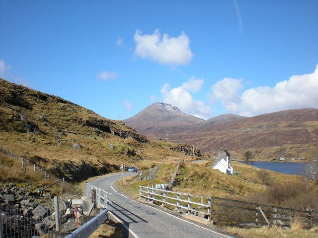 [/img]
I need some colour in my life.
[img]  [/img]
And some more.
Hmm - is that an old photo - the first one?
[img]  [/img]
This one's the wrong colour.
@druidh - well spotted; very old. The kids have refused to go back there for the last few years. Something about interminable rain and nothing to do but enjoy amazing scenery and fantastic food.
It was the narrowness of the road that got me. I'm sure it's been widened?
I guess I'll have to go back and have a look. Meanwhile, some more colour:
[img]  [/img]
Goppingly gopp gopp, this place is useless, how out of touch are the mods on here, rip the heart out of the stories and threads by making it payasyougo for the comments and tags and now this.
Well done STW mods I'm off until you get your acts together, I can only take so much useless idiocy and modern living has maxed me out for now! 😆
Mods?
I know you're joking but mods errr moderate we don't do the magic coding bits.
That grey titles thing is clever. When I'm looking at the rest of the page, the titles go all blurred... just me?
btw, I don't see "Block-user", so I presume that was humour ..
I know you're joking but mods errr moderate we don't do the magic coding bits.
Seems like no-one does the magic coding bits!
BOOOM!
[img]  [/img]
Seems to be iPhone unfriendly.
Very slow to load
Super quick here. The site architecture hasn't changed. The CSS has. No reason it should slow down on any platform. Or speed up for that matter although strangely we've had equal numbers of reports of both.
We like it.
[i]we've had equal numbers of reports of both[/i]
perception is everything 🙂
🙂thebikechain - Member
We like [s]it[/s] the free t-shirt you sent, so we'll be as sycophantic as you like
Or speed up for that matter although strangely we've had equal numbers of reports of both
LOL - this means it hasn't changed just that some people are *****!
Super quick here. The site architecture hasn't changed. The CSS has. No reason it should slow down on any platform. Or speed up for that matter although strangely we've had equal numbers of reports of both.
Will there be any non-superficial changes? Mobile version of the forum, perhaps?
Do you think theyre trying to ween people off the forum with making it harder on the eye? I think its a downgrade really.
Yeah - of course they are 🙄alexxx - Member
Do you think theyre trying to ween people off the forum with making it harder on the eye? I think its a downgrade really.
I think they're trying to ween people off the magazine by making it heavier too.
I think people should learn to spell wean.
I think they're trying to ween people off the magazine by making it heavier too.
its the most subtle solution to the average STW reader getting fatter. if only the NHS took note and made the amount of paperwork staff and patients have to carry heavier!
[i]I think people should learn to spell wean.[/i]
I was just quoting the other bloke.
DezB - Member
[i]I think people should learn to spell wean.[i]
I think people should learn to use the markup buttons.
It'll be slower to load because grey is in the CBA color spectrum.
Jamie,
Yes
Christ.
It's rubbish, isn't it?
Who had the final say on it?
You still here?bullheart - Member
Christ.It's rubbish, isn't it?
Who had the final say on it?
Who had the final say on it?
The previous poster I presume. 😆
Mark,
Thanks.
