Bit of a debate at BBB command centre about poster design. We need to get the next batch printed and someone wants to change the design. The original is subtle and simple
[img] 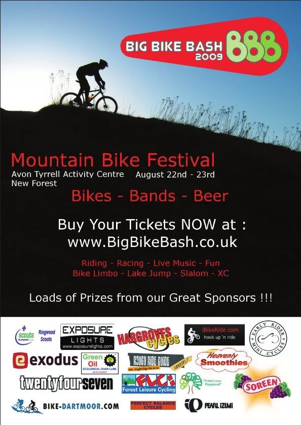 ?t=1243844794[/img]
While the new proposal is funky and garish.
[img] 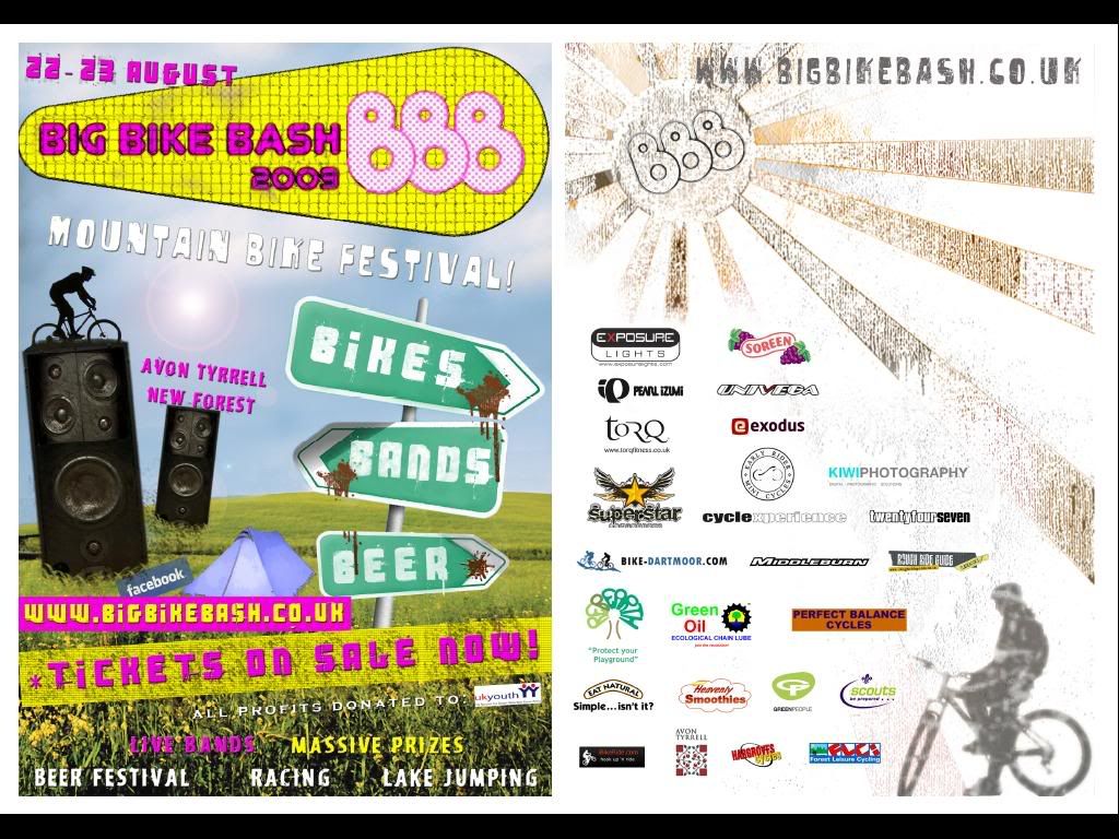 ?t=1243844524[/img]
Please let me know which do you reckon looks best before I get another 10,000 printed.
The new one is showing front and back of the flyer BTW
Subtle is really cool. Funky is horrible. Just my opinion though!
I like subtle. But then, that's the kinda guy I am.
I prefer the subtle one to be honest!
I am spotting a trend here. Anyone for the funky one?
they are both crimes against design.
when you say 'funky' you really mean 'my cousin is doing GCSE art and has just got a new computer' don't you?
by contrast the subtle one is a design classic
Does anyone like the funky one?
I prefer the funky one, the original looks very bland and the text is all over the place imo!
I prefer the funky one in terms of layout, but not the yellow and pink colour combo, how about black and fluoro green?
To much Pink,thinks Village People.
Did you choose the font for the original or just leave it as the default in Word?
Funky (second) one seems to convey better what the event is about. like the speakers. is that a trials obstacle? 🙂
To much Pink,thinks Village People.
WCA - this herbert is trying to get your thread to degenerate into another "is STW homophobic ?" thread ........... STOP HIM !
Funky one is much better.
10,000?? I thought tix were limited to 500??
I prefer the funky, just because of the bikes,beer,bands signposts.
And to MrSmith etc- he's asked which do you prefer, not "any smartarses here think they could do better?"
The funky one sucks. Horrible colours and is very confusing - is not immediately obvious what it's for. Also looks like every other "funky" poster
ist one and is that how the singletrack will be? i don't like to be crowded
The tasteful one makes it look about as much fun as arse cancer.
Is there any racing at this event? I wasn't sure from the posters?
I like the Funky one better!
Maybe need to mention its also a kid/family friendly event on the flyer ?
That logo is shit...
As we will be going double sided for the next flyer batch we might have one side subtle and one side funky although the funky colours may change.
Will add postcode, family friendly to the design.
DezB - don't worry, it is still limited to 500 people but it is cheaper to print a batch of 10,000 flyers than 2,000 for some reason.
The 3 B's look a bit Yellow Submarine-esque to me, does this mean free acid tabs on the day? 😀
They both suck - hard.
Funky one is fine. First one looks majorly boring.
like the funky one but i don't think either really give a very good idea of what's going on at BBB
In general I'd go for subtle over funky, but in this case I prefer the funky one- the other one's a little bland.
thombthumb - I thought the bit on the bland one saying - Riding, Racing, Live Music, Fun, Bike Limbo, Slalom, Lake Jumping, XC - gave a bit of a clue
What sort of info were you after?
