UPDATE: Reviews section refreshed, redesigned, searchable: Go take a look
Why was one of the photos upside down?
Result! 🙂
(The Long Mynd one still comes up as html though)
I’ve just re subscribed to print after hearing about the changes so that I can make my own mind up about them as they sound much more like what I think I want. Kit and bike reviews just all sound the same after a while.
@mtbfix, you are not alone, see my comments somewhere above. The text (smaller than normal page text!) in the colour boxes is difficult to read for us aging souls. Maybe its put together by 20 somethings with perfect eyesight and looks "trendy" to them. Just because you can do this kind of design on a computer doesn't mean you should.
There's a lot of mags with this werid text colour design. Can't say I've noticed particularly in STW as some are far worse. I once posted on a mag's Facebork site - with all these lovely words, you must want readers to be able to actually see them! They had blue text on some speckled purple background. Bloody ridiculous.
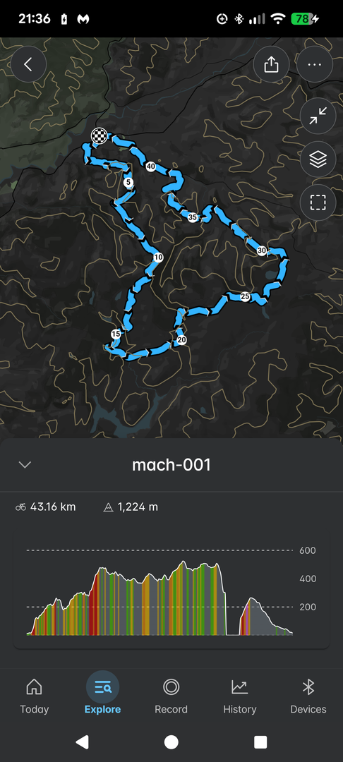
Without a map and with html files I can't download ( either to my Wahoo or to Memory map) the route guide seems a bit pointless to me.
100% this. I love a paper-based map route guide. Would definitely subscribe if these were a thing.
don't know the exact location or there's some semi-understandable 'don't want folk to know' issues
hmm, surely they'd remember approx where they were?!
and as for keeping places secret, because they oughtn't be there or because they just don't want to share? :-/
Surely if you don't want to share or keep them secret you don't write an article to be published in a magazine?
I quite enjoyed the new format with some interesting perspectives I had not thought about before. I do like ‘Through the Grinder’, but not needlessly long kit reviews. I appreciate good photography but less appreciative if I have no idea where it is.
I’m a little slow at reading the magazine (blame having young children), I’m only on 152 at the moment! What number am I looking out for the change?
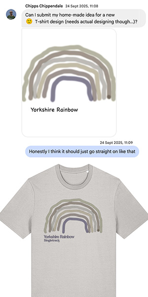
Did chuckle at Amanda’s doodle .
I subscribed after a long time of not reading (last issue I bought was the Covid special!) and for my preferences, the magazine is a massive improvement.
I really like the move away from glossy pages to a more 'earthy' paper feel, which I imagine makes the mag more sustainable/easily recyclable.
I didn't even realise there were no reviews, but I echo other comments here that they're not really needed or relevant any more. The internet (and these forums!) are for product research and theres no way print media can keep up with that pace.
Most of all though, I enjoyed and read each article; disappointed when I realised I'd finish it so quickly! To me Singletrack seems like a mini-Cranked; and at one point I had read every issue of that. I dearly miss Cranked so re-discovering this new Singletrack format was lovely.
There is much more room for magazines like Cranked in print media; articles that either remain relevant or show a particular point of view at that time. So for Singletrack to assume a similar stance is both welcome and makes a lot of sense. Aside from a couple of proofreading issues, it was a thoroughly enjoyable read.
I wonder if my local library has the mag in large print format.
You jest, but my local library gives me free access to hundreds of magazines online (MBUK, Cycling Weekly, Cycling Plus etc, as well as the daily newspapers) you can enlarge the font as much as you like. You don't even have to visit the library, read it all at home or on the go.
I also hadn't noticed the lack of reviews as I never bother to read them. Like the new format, more route guides though please.