*Read annoying
First world problems I know but got new headset fitted today (don't have a headset press of my own) and I guess I assumed that if you had something with matching logos you'd just match them up? Cost me £15 which was more than other places but happy to support a small lbs. I noticed it immediately and didn't say anything but it's already starting to bug me.
Given the headbadge needs reattached, the cable adjusters don't match, the outers need trimmed and looks like an allsort I should probably just get over it but the other bits will get sorted soon. And that headset will always look like that. Forever.
[img] 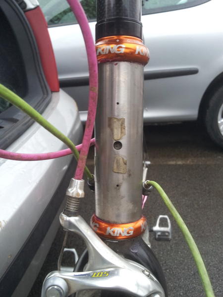 :large[/img]
Pink cables
POS bike
1st world problems
Rule 5
Shall I continue?
Big set of stilsons would sort it.
If you wanted alignment then you should have specified that beforehand IMO 🙂
Find a skip
Rorschach, are you suggesting the Lemon(d) is a piece of sh*t bike?
You're worried about headset alignment when your bike looks like that?
I call troll.
It's just a big lack of attention to detail from the shop. Very poor show in my opinion
It doesnt really matter but I can empathise. Do you know anyone with a headset press? Id sort it for you but your not in Glasgow eh? 🙂
Go back to LBS with a large pack of biscuits, explain you are an anal ijit and ask politely if they would mind refitting the cups lined up. They may laugh at you, but will probably re-do it for you.
(Although I agree they *should* have lined them up in the first place)
Probably my no1 attention to detail pet hate on bike builds is a non-aligned headset! Regardless of the cables i couldn't live with that. Shoddy job.
Although I agree they *should* have lined them up in the first place
Well not if he has not specified it...
See I like my heat set not to be aligned, but rather to have the marking to be equidistant from the middle of the head tube.
I'd expect it to be straight tbh, doesn't take any time to do it right.
But tbf I would also look at your bike and conclude you don't care what it looks like.
Has this LBS taken on a new Saturday-boy recently? Looks like it.
If it was mine I'd be well pee'd off.
Mind you, if that bike was mine I think I'd have spent my money elsewhere first. 😉
This isnt anal, its called attention to detail. £90 on a king headset and they put it in on the piss? name and shame!
Not in 100 years would the shop owner think the op was anal about the look of his bike with the state of hat car crash, even if I got the headset for free I wouldn't fit it and mi Scottish. I'm not even going near the cables. In fact I no longer want to all about it, as I am scared I wake up in he middle of the night in a cold sweat crying for my mum.
Not a troll and yes it needs some tlc but after the winter it'll have new cables and hopefully I'll have found the right size screws for the headbadge. It will also get a new groupset at the end of next year all being well. To be fair it's decent given it cost me about £500 to build it up and it's ti and carbon.
Not in Glasgow Merak - I'd have a few options for getting it sorted there but ta for the offer.
I'm going to ask them nicely tomorrow.
I always lined them up when I working in a shop and I totally agreed with you when I read the post...
However...
I've changed my mind now I've seen the pic (sorry).
In happier (cleaner at least) times
[img] 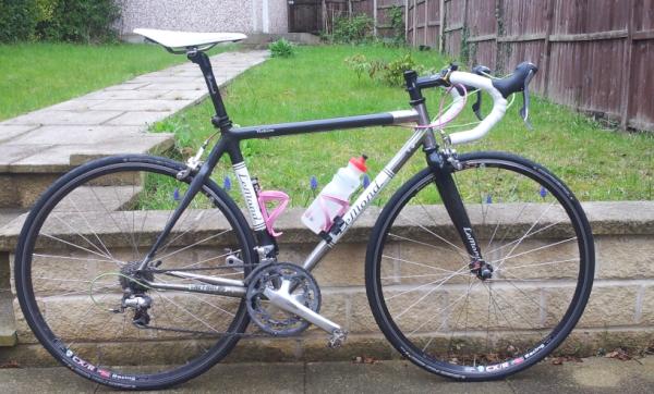 :large[/img]
[img] 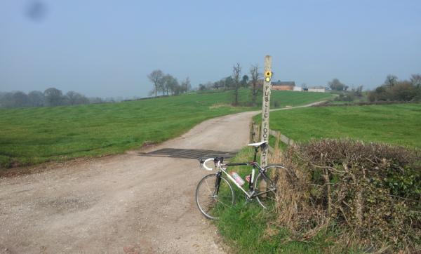 :large[/img]
I honestly have no idea whether the logos on my headset(s) are lined up or not. I've never thought to look. Does that make me odd?
fontmoss, does that headset badge need bolts or rivets?
I've struggled to get a definitive answer, Lemond victoire 2002 I think? Badge like [url= ![]() ]this[/url]
]this[/url]
The poster clearly isn't alone in thinking this is a bit shoddy.
Maybe I'm missing something, but by 'not aligned' do you mean the writing is not lined up correctly between top and bottom cup? Is it meant to be!? I wouldn't have even noticed.
but fair play its your bike.
To be fair, in an ideal world the mechanic should have pride in his work regardless of whether hes working on a 7k race bike on a £70 shopper. I would have lined the logos up and had them inline with the bar clamp, I would also have chosen a silver King, but Ive got OCD.
Your right to take it back, but as mentioned diplomatically offering a tin of biscuits, although I believe you shouldn't have to. Mibbe you should have asked that they line them up, mibbe they should have done it as a matter of course.
This is why I do everything myself cant be doing with shoddiness, devils in the detail.
Bike looks good, that first pic is selling it short.
Maybe I'm missing something, but by 'not aligned' do you mean the writing is not lined up correctly between top and bottom cup? Is it meant to be!? I wouldn't have even noticed.
Yeah fitted properly just attention to detail imho
plus if you really want to annoy a customer you just fit them upside down 😉
Does that make me odd?
No, at least I don't think so. I've got a CK on one bike and I don't have a clue if it lines up.
Nice bike mister. I had a LeMond in 'cannibal' orange with the white panels, lovely it was. I do love the internet, one photo that shows hardly any of the bike and everyone's queueing up to call it a POS and suggest skipping it.....
Anyhoo, I had a King fitted at my LBS a few years back, I asked the mech to make sure the logos were aligned and he was properly offended that I even felt I had to ask. So you should have asked to be certain but also shouldn't really have had to, take it back.
Wouldn't bother me in the slightest, and I'm I right fussy bugger when it comes to most things, but then again I don't get the whole tyre graphics and valve alignment crap that gets spouted on here
I used to offer to fit them upside down on custom builds as it makes no difference to the function, but no one ever took me up on it.
Wouldn't have noticed, wouldn't care if I had noticed.
Burn the heretic!!!!!M6TTF - Member
I don't get the whole tyre graphics and valve alignment crap that gets spouted on here
Nah, should have gone for black. 😉Merak - Member
I would also have chosen a silver King,
Cheers Dave I like it despite the comments! I had a lemond in that colour scheme before and loved it, sold it ages ago and was looking for another when found this frame and forks.
Regarding the king colour I think black or silver would be pretty dull on a black and silver bike. The cables were on offer when building it up but will be black when replaced and the cages will make way for steel king cages when money allows. So the mango will be the only hint of colour at that point.
I guess the moral of the story is if it matters to me then it matters. I shall give them a call tomorrow and ask very nicely if they;d mind changing it. If they do then I'll wait until back in Scotland to get it sorted but I've convinced myself I *need* to change. God knows what that says about me.
New pics to be posted once it's had a new lease of life, ta for all the comments certainly brightened up a dark November night.
I'd have asked them to line it up if I'd spotted it in the shop.
You could still ring them up and ask if they would.
You don't ask you don't get.
I like to fit CK headsets upside down and out of line. It's seems to really annoy some people for some reason. We once did it for a customer who was also a friend as he was also logo line up anal, as he was useless with tools it stayed that way and annoyed him for quite some time!
JRTG you made me chuckle :D. I am glad people who actually ride bikes aren't on STW 😀
no way I could let that out of the shop. For the record if spacers have logos I line them up as well, And the top cap, It's not anal, just doing the job properly.
Get it back to shop 😉
Given the headbadge needs reattached, the cable adjusters don't match, the outers need trimmed
Never nind the bike, what's your objection to using the words "to be"?
Or are you Scottish (making English a second language)? 😉
If my bike came out of the shop with the logos all lined up, I'd have a paddy and insist they take it back and wonk them up. Thankfully I never need to take it to a bike shop and if I did, it would be my mates and would come back messed up with bearings dropped in the tubes and in the bars....
and I'm I right fussy bugger when it comes to most things, but then again I don't get the whole tyre graphics and valve alignment crap that gets spouted on here
Contradiction surely... Tyre logos not lined up looks crap. Ditto headset logos. Although agree with Juan that equidistant from head tube centreline often looks better.
So if the headset cap has, say, 5 logos on it, do you set it up with one logo to the front, or one to the back?
And that's not anal - specifying the brand of nipple to use in your wheels is anal. I've had that 😉
They clearly need sorting along with several other things - cables etc.
Just pop them out and put them back in. Nothing permanent there and as others have suggested sort out the English if you are into attention to detail. You are just asking for trouble!!
I hope the trend for gopping great logos on things ends soon.
Rims look cheap and nasty, I liked the old small labels. And monster truck printing on tyres like kids toys, as opposed to subtle little logos in just one place.
Yuck.
Ride it and stop whinging there is nothing wrong functionally with your over priced headset and aligned logos or not your display of wealth is still very visible to all...
Sorry cookeaa I have to defend font here, it's not overpriced at all! I sold it! And I'm with the guys sayin I would never have let it out my shop like that!
Chris.
