- This topic has 11 replies, 10 voices, and was last updated 3 years ago by binners.
-
Football Kit & Colours
-
SaxonRiderFull MemberPosted 3 years ago
What’s with football kit and their respective colours? I was just arguing with one of my kids about the merits of alternative kit. He likes them. I hate them.
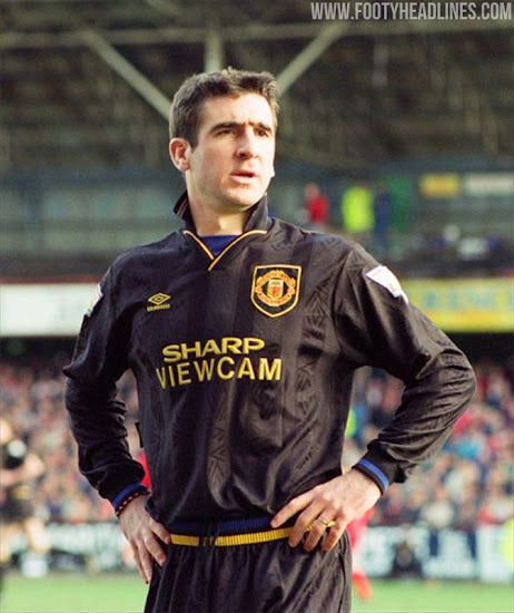
The reason I hate them is that they often bear absolutely no correspondence whatsoever with the traditions/colours of the club. So where do they come from? I mean, take Man U’s away kit as an example. Their traditional colours include red and white, and of course one could argue for a little bit of black and/or gold as it emerges from the crest. But what’s with that hideous peachy/beigey colour of this year’s away kit? Where the hell did that come from? Why would any club have chosen it?
Man City is another. Their traditional light blue for home. Then flipping tie-dye for the third and something from La Vie Claire for away. Bizarre.
Clubs have a heritage, and there is plenty of creative stuff that could be done with the colours normally associated with them, so why the random shit that gets passed off as official club kit?
NobeerinthefridgeFree MemberPosted 3 years agoAs with everything in football, it’s about selling stuff.
CougarFull MemberPosted 3 years agoAIUI,
Historically it was to avoid similar strips playing together, probably a bigger problem in the days of black & white TVs. Today, as the beerless one says, probably merchandise.
joepudFree MemberPosted 3 years agoI feel the third kit is where teams should just do what ever they want. Take arsenal (sorta my club don’t follow football much) red / white for home and yellow / blue for away. third kit who cares. I follow basketball a lot closer and traditionally (until nike took over) EVERY teams home kit white with an additional colour then away is reversed, for example Boston white / green for home, away green / white.
CougarFull MemberPosted 3 years agoIce Hockey is very similar. Their ‘light’ kit is home, ‘dark’ is away in the UK at least, I think NHL is the other war around?
gastromonkeyFree MemberPosted 3 years agoThe away / change kit is to help players and match officials differentiate between the players of opposing teams. Imagine trying to referee a game between Stoke City & Sunderland. They have been around as long as organised league football. The main colours and design (for example the black and amber of Hull City) rarely change, but the away kits and particularly the third kit is more flexible. Having said that, many teams keep a common theme for their away kit. Hull City throughout their history have often had an all white away kit. Third kits have also been around longer than most people realise and they aren’t just an invention of the Premier League and commercial departments of the big clubs. They have been used for a similar reason. As football expanded and leagues became national the more teams involved resulted in more similar kits.
Modern football makes a lot of money from kit sales, so the more kits a club has and the more they redesign them = more sales. Third kits and special designs for European competitions are another revenue stream for the clubs. That’s why the designs of all the kits changes so much from season to season.
Personally I quite like an away kit or third kit. Some have been lovely and unique. Some of my favourite kits from Hull City history have come from the away kits, particularly the green and white gingham design of 1990-92.
theotherjonvFull MemberPosted 3 years agoI mean, take Man U’s away kit as an example. Their traditional colours include red and white,
Wrong! traditionally, yellow and green, which was their away kit some 10/15 years ago.
Some kits are in the grand scheme relatively recent. Arsenal’s kit used to be plain red and then became red and white sleeves in the 30’s.
Liverpool only went to red shorts in the 60’s.
And my team, because we’re the only team from the Royal County of Berkshire – we have the authority to remain in home kit even if away and clashing; you have to accommodate us (but we don’t because 1/ we’re nice and 2/ merchandising!!)
http://www.historicalkits.co.uk/English_Football_League/index.html
twistedpencilFull MemberPosted 3 years agoWhen I first saw the City third strip, sherbet dip, I recoiled, but now I really like it and want a riding top in the same colours.
New City third strip, isn’t going to endear itself to me though, some weird homage to local bands, looks like a pair of my nan’s curtains…
MSPFull MemberPosted 3 years agoMan City is another. Their traditional light blue for home. Then flipping tie-dye for the third and something from La Vie Claire for away. Bizarre.
Man city’s current second kit is inspired by the Hacienda interior. And the third kit is inspired by Sam Hills 2009 fort bill world champs pyjamas.

(not my picture)
loumFree MemberPosted 3 years agoThird kits are awesome usually.
Clubs do interesting things and kids can support their favourite team AND wear their favourite colour at the same time now and again.
Agree that Manu third is crap. But that’s one of their traditions so you’ve just got to accept it. Google the grey kit story Vs Southampton.
But their first and second kits aren’t up to much either, tbh.RustySpannerFull MemberPosted 3 years agoA favourite…..

Man U Newton Heath FC tribute kit, now goes for £150 for a nice one.
binnersFull MemberPosted 3 years agoMan city’s current second kit is inspired by the Hacienda interior.
And Ben Kelly, who designed the Hacienda interior, is a United fan and is not happy about it at all.
Rusty… I’m a big fan of the gold and green Newton Heath kit too. A classic!
And this one:


The topic ‘Football Kit & Colours’ is closed to new replies.