Viewing 40 posts - 1 through 40 (of 64 total)
  • Best Bike Colour Schemes
  • abingham
    Full Member

    A recent classified post reminded me of my old Foxy XR, which I reckon had one of the best colour schemes ever painted on a bike:

    Foxy

    So, what do you think are the best colour schemes to have featured on a bike?

    joebristol
    Full Member

    Raw frame / red forks for me – and currently got a bike in that scheme.

    Quite like a fully murdered out frame scheme too. Preferably a shiny black frame rather than matt.

    Also partial to any kind of decent candy colour with sparkles in it.

    Not a fan of really busy schemes covered in graphics and logos. I don’t love that Foxy above tbh – even if it is broadly jps colours. Would always take forks / shocks with black stanchions over kashima / gold.

    Edit – a frame I think looks ace is an Evil Offering in ‘angry dolphin’ too. Good combo of colour and ‘swoopyness’.

    bsims
    Free Member

    I still very much like my CMYK BFe. It’s simple and works well, looking different from a variety of angles.

    matt_outandabout
    Full Member

    tomhoward
    Full Member

    The more Hope anodised colours attached to one bike, the better.

    abingham
    Full Member

    The more Hope anodised colours attached to one bike, the better.

    Controversial!

    continuity
    Free Member

    You can have as many pieces of anodised bling hope aluminium on your bike as you have years until you turn 30. No more.

    rossburton
    Free Member

    My daughter’s new build is bright yellow with everything else black and it’s going to look EPIC.

    My FlareMax is mercury with orange grips, so basically a modern version of the bike matt_outandabout posted.

    chiefgrooveguru
    Full Member

    I like really brightly coloured frames with minimal logos etc and all the components in black. See my old orange Soul, my current luminous yellow (allegedly green) Levo and the candy pink Moxie I’m planning. Lots of Hope bits but all of them black. I’ve also had/have two stealth black bikes but only because the more colourful options had too many decals on them.

    There are lots of more subtle paint jobs that look great when clean but my bikes are basically only really clean when they’re brand new. Bike bright colours look better when dirty.

    tomhoward
    Full Member

    Controversial

    Not entirely serious 😉

    swanny853
    Full Member

    Classic Cotic colours- a nice bright main colour and that downtube wrap

    6079smithw
    Free Member
    tomhoward
    Full Member

    Gold you say?

    Nobeerinthefridge
    Free Member

    Yeti turquoise with orange fox 36s.

    Magic.

    this

    breninbeener
    Full Member

    I love the Production Privee colour schemes. I have the 917 Shan, which is in Gulf Porsche 917 colours….but see also the Martini rally car paint scheme and other car based paint.

    They are lovely

    dyna-ti
    Full Member

    ”  The more Hope anodised colours attached to one bike, the better. ”

    Are we talking the same colour or 1980’s a bit of everything ?

    chestrockwell
    Full Member

    Orange/white fade Orange Clockwork.
    Aqua fade Fat Chance Yo Eddy.

    End of chat.

    dc1988
    Full Member

    I’m with CGG, bold frame colour but everything else black

    weeksy
    Full Member

    tomhoward
    Full Member

    Are we talking the same colour or 1980’s a bit of everything ?

    Either the same colour but at different levels of fade, or a bit of everything.

    Esme
    Free Member

    I’m the exact opposite of CGG, neutral frame colour (ideally grey/silver, or maybe black/white) but everything else bright.

    tjagain
    Full Member

    My new Shand ( when it arrives)

    Burgundy metallic paint, black minimal frame logos, all other parts polished ,alloy bars, rims, hubs, brakes etc.  all components delogoed as much as possible

    Classic, understated, clean lovely

    I’ll post a pic when it arrives

    Kato
    Full Member

    Red/blue/white Ritchey’s

    MoreCashThanDash
    Full Member

    Classic Cotic colours- a nice bright main colour and that downtube wrap

    Classic Mk1 Souls don’t have that downtube wrap 😎

    chestercopperpot
    Free Member

    Gold you say?

    That’s matchy matchy taken too far. I think the contrast of matched seatpost and fork stanchions looks better.

    swanny853
    Full Member

    Those are just ‘old’ cotic colours 😉

    velocipede
    Free Member

    Haha glad to see my listing generated this post – it is indeed a lovely colour scheme 👍

    BUT, I am rather taken with my Shand 😁

    ElShalimo
    Full Member

    Baum do some stunning bikes

    jimmy748
    Full Member

    Classic and classy.

    6079smithw
    Free Member

    ^Very

    also a classic
    marin

    welshfarmer
    Full Member

    Loving the colour scheme of Stefan Eberharters new Liteville build.

    abingham
    Full Member

    Red/blue/white Ritchey’s

    That’s a good shout.


    @Velocipede
    , I’m going to say it – if there’s one frame colour that’s almost guaranteed to look great, it’s yellow. See Starling Beady Little Eye for proof: https://www.starlingcycles.com/bikes/beady-little-eye

    Mugboo
    Full Member

    Rocky Mountains in that red and white mapleleaf.

    And Cotic’s in duck egg blue.

    b230ftw
    Free Member

    I used to frequent the Retrobike forums for a long time and some of the standard colour schemes/designs in the 90’s were just unbelievable. Even in quite low range bikes they put stupid amount of effort into the paintwork. Unfortunately as can be seen on this thread all you get nowadays is a single colour with some computer drawn graphics on, so sorry I can’t get exited about a yellow bike with the manufacturers name in black type on the Dow tube!

    One of the regulars on RB was someone who used to be resonably senior at GT bikes. Remember those amazing multi colour splatter/stipe paint jobs in early 90s? Apparently they had to go through the paint booths 3 or 4 times, even the entry level £200 bikes, as the paintwork was pretty complex to do (and their paint is indestructible too!).

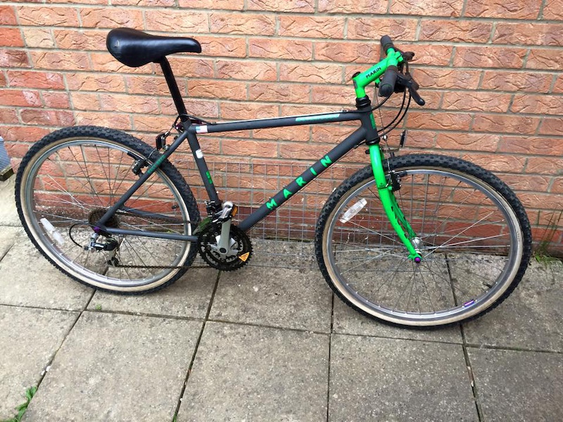
    The Zolatone paint on those Marins is impossible to replicate as Marin got a company called Zolatone to make it for them (they are still a specialist paint company) – RB members have tried to replicate it and got close but not perfect as they don’t make that paint any more.

    And that’s just the bog standard bikes!

    Klein paintwork is stupid hard to do, they have several coats of colour on top of each other to get that amazing result – people do repaint them successfully but you have to know the colour combos they used for the final colour or it won’t pop like the original. Needless to say getting one of the (very limited) people who are skilled enough to do it for you is very costly.

    endomick
    Free Member

    The blueberry Nukeproof Mega from 2019 was super nice, if the red decals were outline instead of solid colour it would have been near perfect.

    alanw2007
    Full Member

    I like the bright ones! Can’t stand the black/matt black/gloss black/so much black that many bikes (especially the top end ones) have.

    Kudos therefore to Trek with their current paint jobs:

    null

    monkeyboyjc
    Full Member

    When building my own bikes i’ve almost exclusively bought black frames when I can – the resale is a fair bit easier & I’ve only bought anodised coloured themed bits when I don’t aim to sell on in a year or two for the same reason.

    hooli
    Full Member

    Raw or Matt black for me, I’m a simple man with simple tastes

    sharkattack
    Full Member

    This isn’t my favourite but I can’t believe no one has posted it yet. It’s usually first up in threads like this.

    Nothing else really springs to mind. I really like the multicoloured neon, fade and splatter jobs from the 90’s but it’s hard to find good pictures of them.

    Some of the DH bikes which get painted up for the WC look incredible.

    nickc
    Full Member

    I had one of those Shans. If I’m honest, it’s a lot of the reason I bought it in the first place, that they turned out to be pretty good bikes as well was handy (and a relief)

    I’ve always liked the solid red Trek Slash, I don’t know why, it’s not a particularly inspiring paint job, just always though it looked cool. Saw one in the flesh this year, still think it’s a nice colour.

    Trek Slash 9.9 29 Race Shop Limited review - BikeRadar

Viewing 40 posts - 1 through 40 (of 64 total)

The topic ‘Best Bike Colour Schemes’ is closed to new replies.