Home › Forums › Chat Forum › Attitudes to processing images
- This topic has 166 replies, 52 voices, and was last updated 7 years ago by justinbieber.
-
Attitudes to processing images
-
bob_summersFull MemberPosted 7 years ago
there is an art to photography in the same way there is an art to making a good pizza or making a bespoke suit.
which is why art also carries the dictionary definition of a skill or craft acquired through practice. (edit, cross posts with JimJam)
Being neither a photographer nor an IT geek, I find it interesting to hear all sides of the argument on this, be they from middle managers or consumer goods studio photographers – neither is less valid than the other IMO 😉
justinbieberFull MemberPosted 7 years ago@GeeTee – There are good photos and there are bad photos. Just because one is taken in a studio doesn’t make it more or less likely to fall into one category or the other. Personally, most street photography leaves me cold and uninspired, but if it floats someone else’s boat then so be it – I’d rather look at a nice landscape or action shot, but that’s just me.
Regarding the two images you put up, the B&W one is interesting, but looks nothing more than a snapshot, and I don’t rate the studio shot either. The lighting is odd and the composition is awkward, probably because it’s been taken out of context. In a double page spread advert with some copy and logos, it might make more sense. Humph…
*wanders off to open up photoshop*
sandsFree MemberPosted 7 years agogeetee1972 – Member
I will give you two really good examples:The BW image taken by an “up and coming NY based fashion photographer”.
… yet it’s execution clearly shows the photographer to be a skilled studio shooter.
Huh? It’s an available-light street portrait.
I struggle to see what this has to do with fashion photography. It reminds me of those ‘Apprentice’ TV shows where they are tasked to make a commercial and end up trying to be Cecil B. DeMille without any shots of the product.
To me, it looks like a poor man’s Tom Daley who’s lost his shirt and covered himself with a piece of 1980’s bedlinen.
The Pink dress photo you juxtapose “This image however is not art” was never intended to be ‘art’.
From the info of your posted image:
Winter collection – Formals and casual wear 2014 release! (scroll down 7 photos)It is an image intended to show-off and ‘sell’ the dress – which it does well.
I.e. this dress covers the bust / has straps but is backless / will swirl out if the wearer dances at a party.
I do like your own image ‘Brighton Front’.
However, FYI, whenever you post images on STW, they always look too dark on my monitor.I am well aware of this curious effect (put it online and it appears darker) with my own images. So, whenever I have finished PP, if the photo is going online, I will usually tweak it a bit (E.g. increase gamma).
colournoise – Member
I post-process according to the Spinal Tap mantra…Applause 🙂
geetee1972Free MemberPosted 7 years agoHuh? It’s an available-light street portrait.
Yes it is, albeit one shot on a large format camera. That picture won an international portrait photography competion. I love it; I love this style of work and the art for me is clearly evident. If anyone is interested the body of work it’s taken from is here:
Ethan James Green on Lensculture
and here:
He’s a fashion photographer and a lot of his editorial work is shot in this style. I say you can clearly see the evidence for his experience as a fashion photographer because of the way he’s composed the image, in particular the pose of the model.
If you look at Richard Avedon’s work, and compare his fashion/editorial work with say his portraits from ‘In the American West’ (a body of work that is utterly sublime) you can see the evidence of one informing the other.
However, FYI, whenever you post images on STW, they always look too dark on my monitor.
Yes this is a real problem for me. I recently put together a book on Blurb where all the images came back too dark. I have got a technical gap in my skill/knowledge here that I would very much like to fix. It’s not how I intend the pictures to turn out.
Just because one is taken in a studio doesn’t make it more or less likely to fall into one category or the other
I never said it did, I said that it gets harder to execute as art versus editorial.
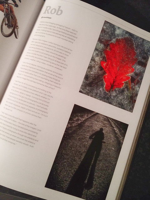
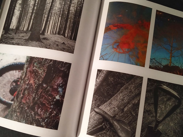
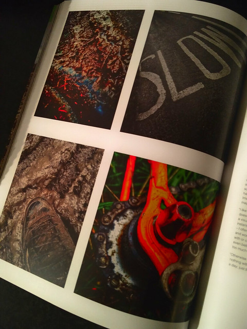
colournoiseFull MemberPosted 7 years agoA little footnote. At least someone out there thinks my horrid non-photos are worth looking at…


😯 😀
The topic ‘Attitudes to processing images’ is closed to new replies.
