Home › Forums › Chat Forum › Attitudes to processing images
- This topic has 166 replies, 52 voices, and was last updated 7 years ago by justinbieber.
-
Attitudes to processing images
-
sirromjFull MemberPosted 7 years ago
I’m a bit wary of post processed images, I’d rather see photographs unadorned.
PyroFull MemberPosted 7 years agoI’m a bit wary of post processed images, I’d rather see photographs unadorned.
If the post processing is done well, you’d never know it was done at all*. As others have said, almost all images have had some form of editing, whether that’s just tweaks to the colour curves, contrast or brightness or anything bigger.
* My personal opinion, obviously.
nukeFull MemberPosted 7 years agoNo photo will ever do justice to what was seen by the human eye at the time the photo was taken imo: so many times, for example, I’ve been up a mountain and stood in awe at the view and come away with a photo that’s just ‘meh’ so if filters/PS/etc can add a bit of that ‘awe’ back, then fine by me…but then most of my photos are for me & my friends with barely anything for public viewing so maybes its different for ‘real’ photographers
BadlyWiredDogFull MemberPosted 7 years ago‘Photoshopping’ is such a generalised term that it’s pretty much meaningless – it could mean anything from a bit of exposure adjustment on a RAW image to better reflect what you actually ‘saw’ through to completely bastardising the original by adding stuff, taking stuff away, distorting detail etc.
Fundamentally I guess the argument is about whether you should change what the camera captured. But what if what the camera captured isn’t what you saw anyway? It’s arguably better to post-process stuff so that it better represents what you saw.
Or maybe better represents what you felt or experienced.
What if I’m processing images for web site use and I run a set of actions to sharpen it up and give it a little more ‘pop’? Is that a problem? Anyway, I find it hard to get really animated over, except in so far as some publications use Photoshop to create unattainable, aspiration images of people that, in turn, have the potential to create misery in some of the audience.
If a polar bear just a looks a bit whiter or sharper then so what?
MrSmithFree MemberPosted 7 years ago“I’m a bit wary of post processed images”
I come out in hives every time I see a black and white image with one colour object (usually a rose, post box or mid range sports saloon with a spoiler)
Three_FishFree MemberPosted 7 years agoI’m confident that I’m doing exactly what I want to do and getting the results I personally want. I’m confident there’s nothing hamfisted about the way I post-process regardless of how you view the final images.
The picture of the glen looks like a photograph and a selection of processing techniques applied over the top (in both senses of the term). The two things – image and process – are completely separate and distinct elements. Intended, perhaps, but could you explain the relationship between the original photograph, the processing, and the final image? I appreciate absolutely that you’re exploring your own interests, but that is never going to alter the fact that people who know what you have done will perceive and translate your images in a particular way. As a fairly well-experienced digital developer, I would say that your processing is very heavy-handed. That may or may not be your intention, but it is my perception and description.
The parallel would be someone like Picasso (although I’m in no way putting myself ANYWHERE near his level obviously). He was capable of some of the most breathtaking naturalistic images, but spent pretty much his entire life exploring other ways of showing the world just because he found them more interesting than demonstrating his traditional skills.
I think you over-qualify and over-rate yourself, sorry.
roneFull MemberPosted 7 years agoSeems a moot argument. All images have to have processing applied to them whether in camera or software.
A raw image is pretty hopeless without some form of processing.
Software allows you to do the finishing rather than in-camera. It’s as much part of the chain as taking the picture in the first place.
TheArtistFormerlyKnownAsSTRFull MemberPosted 7 years agoI only shoot RAW and prefer to do the editing rather than the camera – I do overdo it sometimes though.
Which do people prefer from these two?
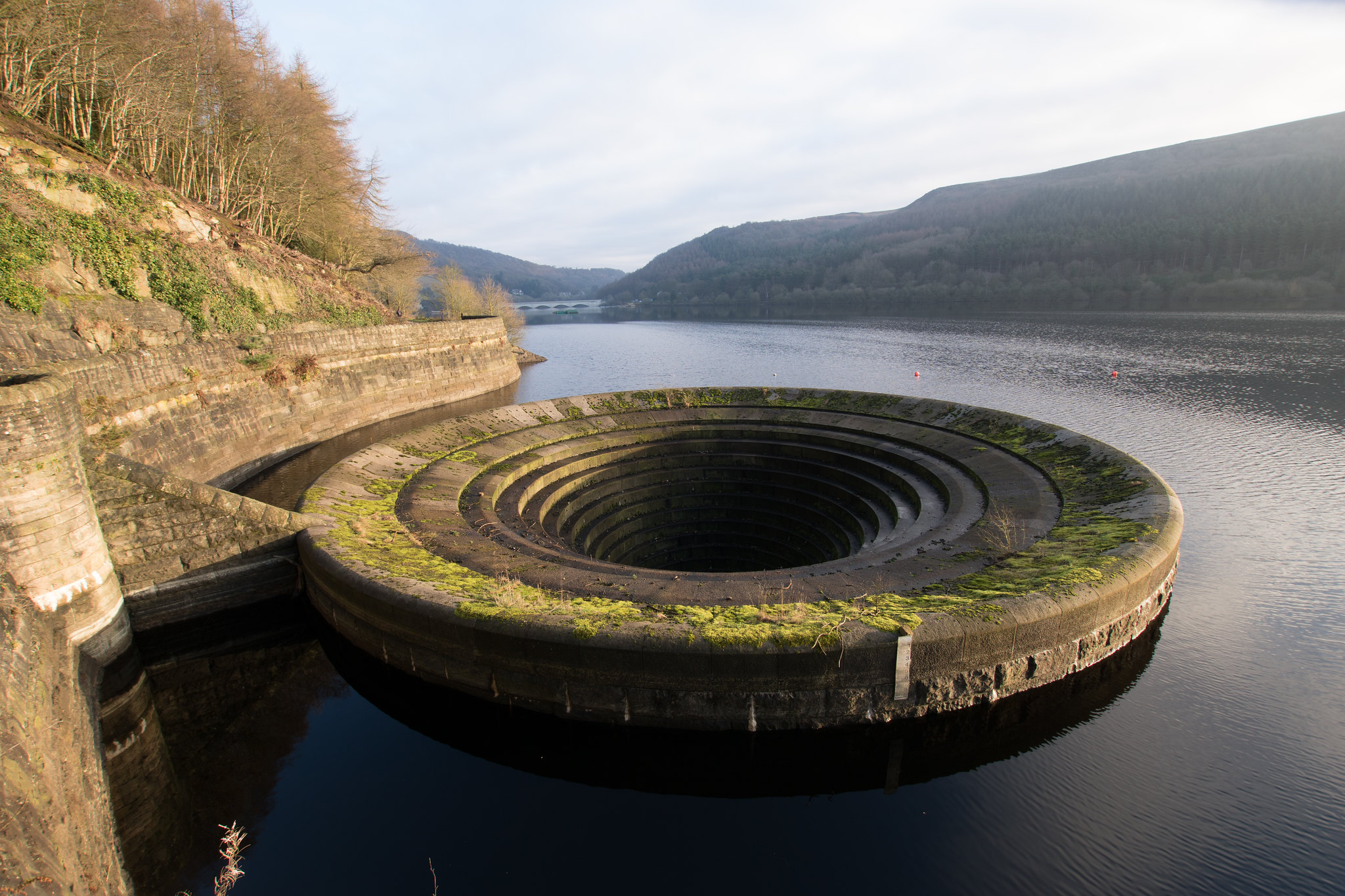 DSC00594 by davetheblade[/url], on Flickr
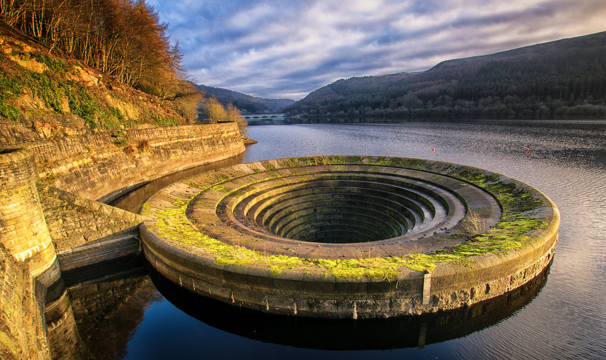 DSC00595-Edit by davetheblade[/url], on FlickrCountZeroFull MemberPosted 7 years ago
I really don’t like the photo of the pine branch on the beach that bikebuoy posted up, it’s horribly over-processed, a sort of HDR that really doesn’t work at all.
The composition isn’t all that, and the pine needles at the branch extremeties have lost all definition and just gone fuzzy.
I’ve no issues with post-processing in Lightroom or Ps, I used to do it as part of my job in print prepress, and it should be as invisible as possible, but I don’t have Ps on my current Mac Mini, and TBH I really can’t be arsed to phaff around tweaking my photos, if I can’t get it to work in-camera, then I’m not bothered.
I’m in awe of someone like Ansel Adams, the effort he put in to get exposure spot on for his landscapes is incredible, because he was shooting 10×8 Polaroid Land negative film, with virtually no grain, and staggering DoF, but I’m more of the Cartier-Bresson school, of get the framing and exposure right then don’t mess with it.
Which works sometimes, but I do end up having to do a bit of cropping if only to get a horizon horizontal or vertical vertical.scotroutesFull MemberPosted 7 years agoDave – for me the question is; which one is closer to reality? The sky in the second one looks more realistic but the grass looks strangely bright – though I’ve seen it do that under certain lighting conditions (usually dull overcast with a shafts of low sunlight).
km79Free MemberPosted 7 years agoWhich do people prefer from these two?
Top one if I have to pick, it looks real. Bottom one looks too fake and obviously played about with. Somewhere in between the two might be the better option.
colournoiseFull MemberPosted 7 years agoThree_Fish – Member
that is never going to alter the fact that people who know what you have done will perceive and translate your images in a particular way. As a fairly well-experienced digital developer, I would say that your processing is very heavy-handed. That may or may not be your intention, but it is my perception and description.And it’s a pretty accurate perception and description, but that’s how I choose to work on and present these images – what’s at issue is whether that’s intrinsically ‘better’ or ‘worse’ than a minimally processed image (or one just processed for ‘corrections’) and there’s no objective answer to that.
Even as a “fairly well-experienced digital developer”, you seem to be looking at this from a pretty fixed viewpoint. People are free to interpret any image in any way they want to, but it doesn’t make any of those interpretations correct. They’re just images and their meaning and impact is constantly in flux.
I think you over-qualify and over-rate yourself, sorry.
Not sure if you’re trolling now, or just not getting it? You really think I was comparing myself to Picasso? FFS. That comment was just an illustration of the fact that there are loads of ways to skin a cat when it comes to why people create images and what they find interesting about the creative process. Technical ‘correctness’ is one of them, just not one I choose to be bothered about most of the time.
Anyway, think I’m going to leave this now. Opinions differ and that’s a good thing, but banging your head against a wall isn’t.
 fishaFree MemberPosted 7 years ago
Reduce the saturation of the lower one, and it’ll look a lot lot better than the top one.
colournoiseFull MemberPosted 7 years agoTheArtistFormerlyKnownAsSTR – Member
I only shoot RAW and prefer to do the editing rather than the camera – I do overdo it sometimes though.
Which do people prefer from these two?As a ‘document’ of a place at a particular moment, I prefer the top one. As an image I’m more interested in the bottom one.
TheArtistFormerlyKnownAsSTRFull MemberPosted 7 years agoBetter?
 DSC00595-Edit-2 by davetheblade[/url], on FlickrroneFull MemberPosted 7 years ago
It’s better but the sky looks too dominant with the rest of the pic. I would back off the contrast on the sky (flatten it) and then it will district you less from the main subject. Basically everything is popping in your picture.
ade9933Free MemberPosted 7 years agoThis could be a very long answer so will try to contain myself.
Generally, I agree with the initial sentiments. An image is not what is front of you, it is what you make of it. It is how you control and use the light and how you see the subject and what you include and exclude from the frame.
There are of course a plethora of photographic styles and some are based on PP (post processing).
If we just think about standard digital images, then all photos are processed. This is usually by a camera to a set of default settings. This was the same with film choice previous to this.
Post processing to me is just taking control of the processing. Sure, it’s not easy, sure it takes skill to do well, sure it’s easy to do badly but if you want a photograph to really be yours then you have to do it. This is just the same as if you were a film tog back in the day.
…the same goes for filters. If you use ND or ND grad filters for landscape images then they all have a colour cast to a greater of lesser extent so PP is actually a more pure way of processing the shots.
…okay kept that fairly brief but that’s my 2c.
geetee1972Free MemberPosted 7 years agoSomeone paid $4.3 million for that!?! Holy ****!
That picture of the Rhine crops up every single time we debate photography on this forum. Without exception.
I quite like the it. It’s a good image; it’s very pleasing and serene and the balance of colour is nice.
That someone paid £2.7m for it has no more to do with it’s aesthetic qualities though than an unmade bed littered with the detritus of sexual proclivity or a cabinet of pills and potions. The only valid question to ask is why the person who created those works has come to hold such high regard that their work commands this price.
Anyway, if you think that’s bad someone recently paid EUR1m for this picture of a spud:
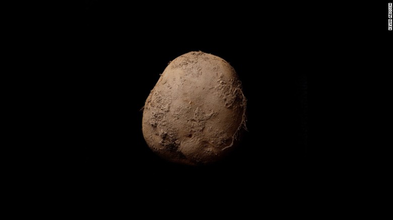
This is not my picture – it was taken by a good friend of mine – but it’s currently in my top ten favourite pictures. I’m interested to know what others think/how you appraise it’s qualities.
 The Cub by TPTopple[/url], on FlickrcaptainsasquatchFree MemberPosted 7 years ago
This is not my picture – it was taken by a good friend of mine – but it’s currently in my top ten favourite pictures. I’m interested to know what others think/how you appraise it’s qualities.
It’s a nice snap.
bikebouyFree MemberPosted 7 years agoLoving the critique, as is always the case in observations like these it’s those who have the biggest gripe fail to post anything they produce.
But that’s ok.
Because I like what I do.
What you do/do not is personal to you.
wordnumbFree MemberPosted 7 years agoI’m interested to know what others think/how you appraise it’s qualities.
Bagpuss.
geetee1972Free MemberPosted 7 years agoIt’s a nice snap.
It is indeed but it goes deeper than that.
 [/url]Photo-Forum 'Best In Show' 2016 by TPTopple[/url], on Flickr[/img]TheArtistFormerlyKnownAsSTRFull MemberPosted 7 years ago
It’s better but the sky looks too dominant with the rest of the pic. I would back off the contrast on the sky (flatten it) and then it will district you less from the main subject. Basically everything is popping in your picture
Whilst I’m always open to constructive criticism, I’ll have to disagree on this one – to my eye, the sky could well have looked like that naturally. Flattening would make the overall picture less interesting IMHO
scotroutesFull MemberPosted 7 years agoWhilst I’m always open to constructive criticism, I’ll have to disagree on this one – to my eye, the sky could well have looked like that naturally. Flattening would make the overall picture less interesting IMHO
[/quote]Looks a lot more natural to me. I can imagine it being exactly like that when you pressed the shutter button.uponthedownsFree MemberPosted 7 years ago@takfastr I agree with rone. Even if I was to look at a sky and let my eyes adjust I’d never see that range of contrast. Back off the contrast a bit and increase the exposure a little and you’re there. Main problem with the photo is the subject and composition not the processing.
I’ve nothing against manipulation in Lightroom or Photoshop. I’ll process a RAW file until the image makes me feel I’ve represented the image how my eyes saw it and how I felt about it when I took the shot. I will also, like most painters, put my interpretation on the image rather than make it a faithful representation.
TheArtistFormerlyKnownAsSTRFull MemberPosted 7 years ago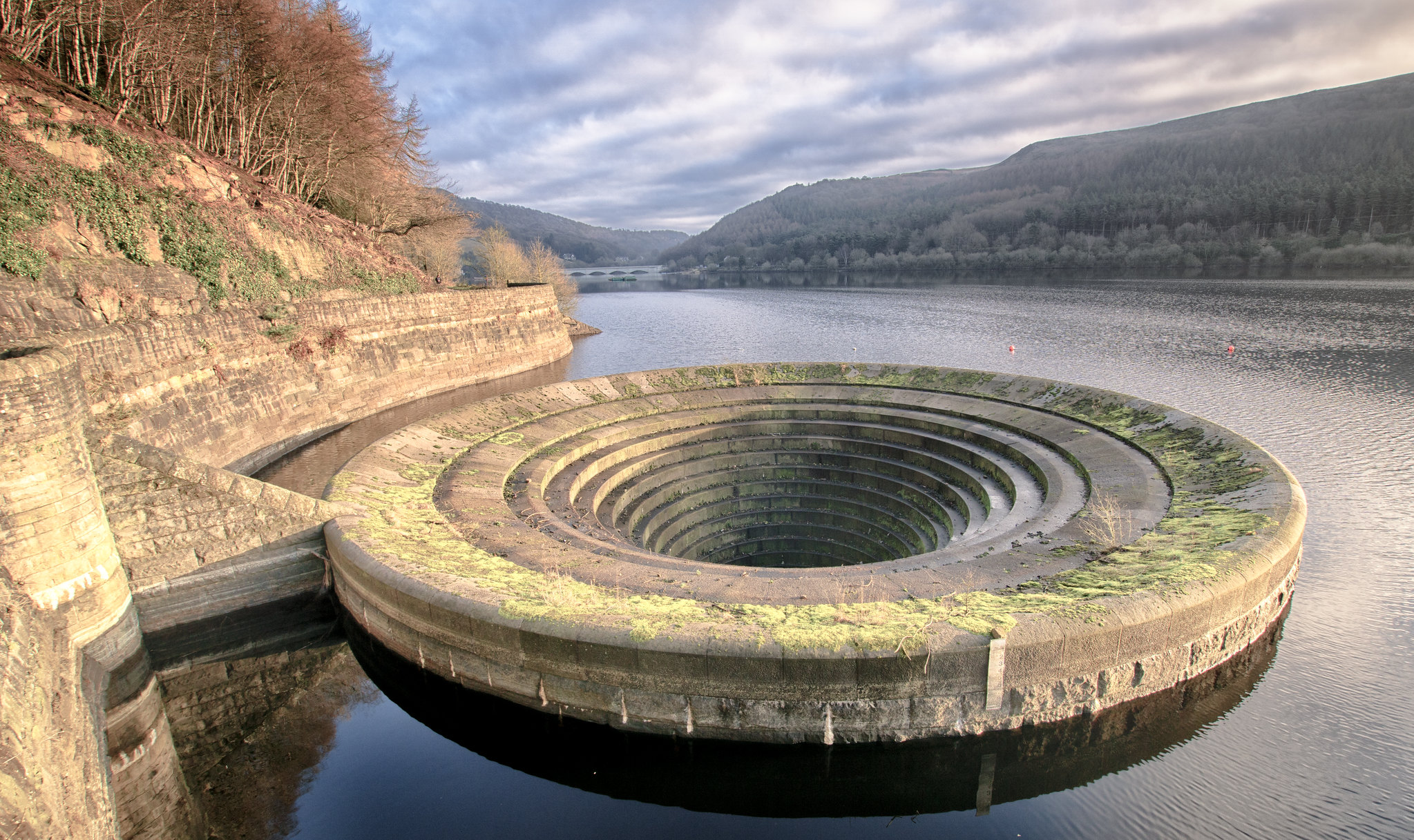 DSC00595-Edit-3 by davetheblade[/url], on FlickrMrSmithFree MemberPosted 7 years ago
changing the colour isn’t going to drastically improve it but you could perhaps level the horizon properly…
SuperficialFree MemberPosted 7 years agoIt is indeed but it goes deeper than that.
Top baiting. I agree, it’s a picture that really works well. I would totally have photoshopped the junk out of the bottom corner though.
That HDR of Ladybower is a perfect example of people overdoing post processing. The initial image doesn’t lend itself to HDR particularly (it’s a relatively ‘flat’ exposure without the dark/light areas that HDR can correct). It’s almost like you chose the effect before you looked at the picture and then turned the dial up to max. I don’t like it.
People have been tinkering with film cameras for years to get different effects. Using different films, dodging, burning, split toning etc. When those effects were used in the wrong circumstances, I’m sure they created terrible pictures, just like people do in PS these days. I guess one issue is that nowadays it takes no effort at all to achieve these effects – a couple of minutes to produce something striking, if not actually good.
BigDummyFree MemberPosted 7 years agoI suspect my perception of this is clouded by the fact that I cannot see what has been done a lot of the time. I can see bad HDR, crude saturation and cast adjustments and dodgy additions, but if someone really knows what they’re doing I probably don’t perceive what they’ve done – the picture will just look great.
So I think I prefer minimal processing, but I’m probably wrong. 🙂
captainsasquatchFree MemberPosted 7 years agoTop baiting. I agree, it’s a picture that really works well. I would totally have photoshopped the junk out of the bottom corner though.
Which is one of the things that make it not really much more than a family snap as one of the judges points out. The photographer was quite lucky to have had the camera ready set up for aperture and shutter speed to be perfect to capture that image. Or it was staged and loses the sponteneity which it’s being judged on.
Nice photo, not brilliant (in my eyes).
My head is really turned by sports photography.zokesFree MemberPosted 7 years ago“but you could perhaps level the horizon properly…”
TBH I’m just not sure it’s framed that well anyway, before the gash HDR treatment, there’s too much distracting from the main subject. In the absence of an ND Grad at the time of capture, I’d be looking at subtly darkening the sky in LR, rather than HDRing it to bring back some of the texture of the clouds. This would also lessen the intensity of the scrappy woodland, especially on the left of the picture (where I’d also try to re-balance the light).
I’d possibly look at the composure of the image a lot more too. Not sure of centring the drain would be too cliched, but it’s sort of plonked arbitrarily where it fits in the frame at present, which doesn’t make the image that gripping to me. Much of this is far easier to do when taking the photo though. I’ve learned with time that capturing the light in the landscape is often what makes a photograph stand out. You can have the best subject and the best composition in the world, but if you don’t have the light to suit either then basically you’ll have at best a record of what you saw.
roneFull MemberPosted 7 years agoI always think a good photo captured at the right moment usually needs only a little processing to make ‘right’as the content is so strong.
The more you tinker with it you are effectively trying to make up for something that is displeasing about it.
We work with digital video/raw video and the best shots just need a nudge here and there.
I’m generally not drawn to HDR unless it is used for something outside the the bounds of normal and towards the surreal.
In fact what you see in a lot of images/films now is a push towards a flatter image as it tonally represents a more satisfying look.
Our acuity though is naturally drawn to a high contrast image – as indicative of quality. You sometimes have to unlearn things like this.
Whatever ever system we use I always make sure the processing is backed off in the camera , the idea being that you are trying to capture the most information possible. So throw out the sharpness, NR and contrast etc. Unless you’re in RAW where that is all a given.
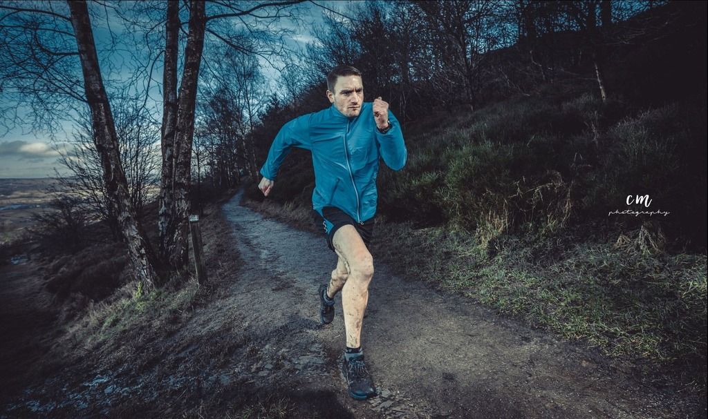
FunkyDuncFree MemberPosted 7 years agoSo what’s going on in this image ?
Seeing lots of images like this st the moment, and because the eye isn’t used to seeing images like it they look good.
Personally not to my taste.
 BigDummyFree MemberPosted 7 years ago
So what’s going on in this image ?
An ugly bloke is going for a jog.
TheArtistFormerlyKnownAsSTRFull MemberPosted 7 years agoI’ll respond, seeing as my picture seems to be creating a bit of vitriol. Erm actually, no specific HDR processing has been added to the photo, it’s a single exposure and an ND Grad was used in LR.
I’m still getting into learning how to use LR, so, love it or loathe it, I know the processing is far from perfect. Each subsequent pic wasn’t a cry for ‘now please tell me it;s great’, it was a response to a previous poster and their idea of what it required (or didn’t) in the way of processing.
Photography can be very subjective – some pictures are undoubtedly shit, some undoubtedly fantastic, some will split opinion. What a handful of people dislike here, dozens like elsewhere. That poncy piece of over=priced tat posted earlier, wouldn’t even make it onto my wall and I can’t say I’m a huge fan of the child picture, but some people obviously love them
RustySpannerFull MemberPosted 7 years agoIt’s purely a matter of taste.
We process images before we even take them – everything looks better after a couple of drinks.
🙂And unless you’re using film, there will be certain degree of processing in most cameras anyway.
Best not to worry about it too much.
jimwahFree MemberPosted 7 years agoFunky – I reckon that runner pic uses an off camera flash, you can see the blast of light coming in from the right of the frame (check the shadows) and maybe there’s one on camera too to fill in. That’s what makes the runner really ‘pop’. Clever use of light is really an art and creates a very rewarding image when done right. Some heavy vignette and a cool temperate applied.
RustySpannerFull MemberPosted 7 years agoMrSmith – Member
I come out in hives every time I see a black and white image with one colour object (usually a rose, post box or mid range sports saloon with a spoiler)Digital pictures that try and look like old film stock.
Kodachrome at the touch of a button?
No ta.
The topic ‘Attitudes to processing images’ is closed to new replies.
