- This topic has 0 replies, 1 voice, and was last updated 8 years ago by molgrips.
-
What's on your Android home screen?
-
molgripsFree MemberPosted 8 years ago
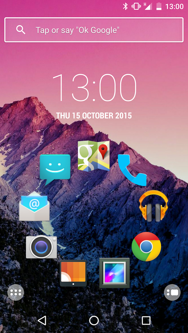
I’ve made an effort to set up my work phone, a Moto 4G on Lollipop. I wondered why there were five pages of home screen, until I started looking through the widgets on offer. Last time I bought an android phone about 4 years ago they were just useless clocks and whatnot, but now I have a choice of excellent work apps.
The main page has a big ‘what’s coming up today’ thing and then app folders on the left with work, personal, and standard google apps in. Then I can swipe left and see a summary of actual emails, calendar and todo. To the right I’ve got weather, phone bookmarks and then on the far right I’ve got a Starbuck card payment button, some google translate links and Shazam.
I’m quite impressed – seems more useful than Windows Phone live tiles in some ways.
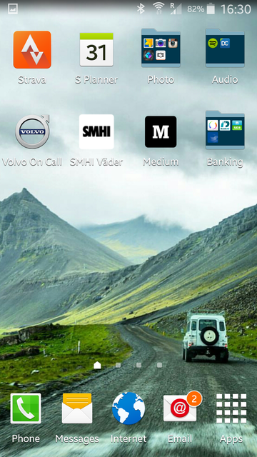
stumpy01Full MemberPosted 8 years agoHere’s mine:

Then got:
in one direction
– a mainly ‘entertainment’ screen with game apps, play store, you tube and Google search bar
– calendar on a whole pagein the other direction
– a screen that used to be mainly travel stuff, so Google Maps, RAC traffic app, widget for displaying notes & it used to have navigation shortcuts on it too – but pared it down a bit though recently, so it is a bit of a mish mash.I used to have screens with Walkman widgets, newsfeed widgets etc. but found that I hardly used them so now just have app buttons where I need/want them.
andytherocketeerFull MemberPosted 8 years agoreduced the 5 screens (or was it 7?) that I had on HTC (mainly there by default to pimp all the HTC bloatware), down to 3 on Nexus…
home page is mostly gmail, calendar, clock, etc.
page 2 is media player etc.
page 3 is all my favourite apps organised where I like thembackground pic is of our group of 3 steel HT all propped up against stones near the footbridge near loch morlich, in a vaguely artistic fashion. because all the lollipop and kitkat bundled backgrounds were lame (not bothered to see what marshmallow ships).
brakesFree MemberPosted 8 years agoI don’t see the point of having wallpaper if you plaster icons all over it so my home page is pretty much blank apart from clock, torch and camera.
DaveyBoyWonderFree MemberPosted 8 years agoCompressed down to two screens.
Walkman (last song played was The Promise by Girls Aloud – yeh baby!), calendar, camera and regularly used stuff like browser, whatsapp, facebook, instagram and gmail.
Second screen back less often used stuff – gallery link, eBay, BBC Weather, Sky Sports, Football Manager 2015 and STRAAAAAAAAVVVVVVAAAAAAAA.
D0NKFull MemberPosted 8 years agoI can hardly read that!
but you can see tthe icons and once you’ve had your fone a few weeks your thumb knows where all the buttons are anyway.
I don’t see the point of having wallpaper if you plaster icons all over it
you can still see it properly when you hit the power button before unlocking the screen.
Google search bar
most used apps (ireader, clock app, calc, whatsapp, strava, mmtracker, keeper, messenger etc)
quick settings (wifi BT GPS etc)
Can’t see much of my wallpaper when unlocked either 🙂
Email preview on left screen
Full clock and less used apps on right screen
don’t use either of the end screens (5 as standard)seosamh77Free MemberPosted 8 years agofolders are a wonderful invention! 😆
The 6 are:
Various, Tv Casting apps, Maps, Music/Audio, Email, Travel,plus whatsapp doubled up in the message icon.
seosamh77Free MemberPosted 8 years agops widgets are keek, i don’t use any. I’ve put them on in the past, but never used them.
molgripsFree MemberPosted 8 years agowidgets are keek
I’ve got a widget with most recent emails and upcoming meetings/calls on it – this is work remember – very useful, don’t have to open an app.
portlyoneFull MemberPosted 8 years agoAll the usual, Clock, Calendar in a folder, message apps in another.
I have a NASA app that replaces my wallpaper every few hours. Best thing on my phone.
DickBartonFull MemberPosted 8 years agoI only have 1 screen, gives me access to my commonly-used apps, anything else, I hit the Apps button for. Not really seeing the need for any more than 1 screen. If I add more I then forget which one has what on it.
Saying that, I do have folders on the homescreen…so it isn’t completely clutter-free.
seosamh77Free MemberPosted 8 years agomolgrips – Member
widgets are keek
I’ve got a widget with most recent emails and upcoming meetings/calls on it – this is work remember – very useful, don’t have to open an app.I’ve never found them to update with any regularity tbh.
gravitysucksFree MemberPosted 8 years agoR-kid
Love the minimalist icons in a circle. How’d you do that?scaredypantsFull MemberPosted 8 years agogmail widget full page on one other screen and calendar widget on another
[url=https://flic.kr/p/zNvvb9]Screenshot_2015-10-15-19-35-45[1][/url]
by scaredypants, on FlickrMoreCashThanDashFull MemberPosted 8 years agostumpy presumably lives where I was brought up…..if he’s in his 40s we may know each other! 😯
I have a photo of my kids
colournoiseFull MemberPosted 8 years agoCurrently trying (none too successfully so far) to use widgets to make my Android phone look and work like my Ubuntu one with its Scopes system. Shame the Ubuntu phone has such a shite camera and I’m tied into Google a bit or I’d switch across fully.
spooky_b329Full MemberPosted 8 years agor-kid – Member
Its this launcher
https://play.google.com/store/apps/details?id=ginlemon.flowerfreeand then this icon pack
https://play.google.com/store/apps/details?id=com.ryanmkelly.me.minLoving those apps…completely changed the look of my phone, spent over an hour last night tweaking it and ended up paying £3 for Pro for the extra flexibility with widgets etc.
Means I can enjoy those rare lucky shots as a wallpaper rather than covering them with a mish mash of multicoloured icons. My only complaint so far is that with nearly every app icon being single colour, the iPlayer app has red in it! However you can make the status bars etc hide with a swipe down to reveal, or they reveal for notifications you select.
P.S Screenshot to come…
JunkyardFree MemberPosted 8 years agoIhave
a scrabble game
E-mail aoo
Strava
Whats app
MM tracker
Sat nav
Stopwatch – need to for work
Alarm
Camera
Contacts
Music
Messages
Telephone
Google
And I store
SettingsCovers about 99% of the stuff i will ever use the hone for
I have one space spare you know just in case 😉
stumpy01Full MemberPosted 8 years agoMoreCashThanDash – Member
stumpy presumably lives where I was brought up…..if he’s in his 40s we may know each other!
Not in my 40’s yet…. 🙂
And grew up in Wembley….only moved to the Fenny flatland fringes about 9 years ago!
MoreCashThanDashFull MemberPosted 8 years agoAah! So stumpy is one of those bloody southerners who moved up, drove up house prices and forced us locals to move away where we could afford to live!
Still, must be doing wonders for the Fenland gene pool….
stumpy01Full MemberPosted 8 years agoMoreCashThanDash – Member
Aah! So stumpy is one of those bloody southerners who moved up, drove up house prices and forced us locals to move away where we could afford to live!
Still, must be doing wonders for the Fenland gene pool….
Well, my Wife is a local – grew up around Glinton & Deeping.
Drove up house prices!? I’d love to see what they used to be, if they’ve be ‘driven up’!! 😀
I like to think I am adding a certain classy sophistication to the area that’s for sure, and improving the gene pool too!!
spooky_b329Full MemberPosted 8 years agoNot played with the gestures yet, its definitely an App that’s needs some to-ing and fro-ing to work out what things do and how to get it looking right 🙂
Whats the SeventyThree, temperature in Fahrenheit?
molgripsFree MemberPosted 8 years agoRight. Broke my Lumia trying to fix it last night, so have upgraded my personal phone to android too. Samsung S6. Not quite convinced yet, the visual onslaught and bloat warehouse (not to mention aggressive auto correct) are making me miss the clarity and simplicity of my Windows Phone. And why the funky isn’t there a comma on the main keyboard?
Going to have to try and clean it up as much as possible.
spooky_b329Full MemberPosted 8 years agoTry the Google keyboard, I find the predict/Swype on others inaccurate, also you can turn off the corrections. Comma…try holding down on the full stop and then sliding to the icon you want.
The bloatware that you can’t uninstall, you may be able to hide in a folder in the app tray.
molgripsFree MemberPosted 8 years agoAlso,why have Samsung put the back button right where my thumb can’t reach it?
nedrapierFull MemberPosted 8 years agoCouple of widgets – sunrise/sunset (or civil dawn/civil dusk as it is here, you can choose which, sometimes I want to know when sunset is if I’m out taking photos, sometimes I’ll want know a better idea of when it’s going to be Dark)
and Rain Alarm.
2 photo things, both do good things the other doesn’t. The S thing is a memo pad – handy to note down that band, gig, book someone’s just told you to look up.
As others have, screen to the left is entertainty stuff, couple of games, music, pocketcast, instagram. Screen the other side is navigationy tools: copilot, google earth, maps, night sky, goggles, barometer/altimeter, strava, city mapper, uber…
nedrapierFull MemberPosted 8 years agoI don’t really see the point of the google input bar – it takes up a lot of space, and for the sake of one tap, you may as well launch chrome and search from there.


 [/URL]


The topic ‘What's on your Android home screen?’ is closed to new replies.