- This topic has 94 replies, 71 voices, and was last updated 14 years ago by .
-
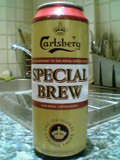
What is your favorite logo and why?
-
.jpg)

 Like the ibis logo second the spesh logosimple but looks class!!


The topic ‘What is your favorite logo and why?’ is closed to new replies.
The topic ‘What is your favorite logo and why?’ is closed to new replies.