- This topic has 48 replies, 22 voices, and was last updated 7 years ago by yourguitarhero.
-
Anyone bored? Help me with a job interview – critique a webpage?
-
yourguitarheroFree MemberPosted 7 years ago
Slightly cheeky, but hey ho.
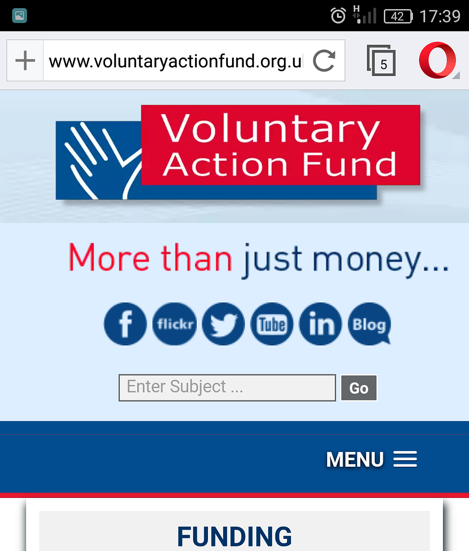
Have an interview with these guys next week: http://www.voluntaryactionfund.org.uk/
Have to do a wee presentation about their webpage – what improvements they could make etc
Have a few ideas myself but just wondering if anyone had any insight? A different perspective is always good
antennaeFree MemberPosted 7 years ago“So Mr yourguitarhero, we noticed a spike in referral traffic from singletrackworld.com this week. Can you tell us anything about that?”
mattyfezFull MemberPosted 7 years agoFrom a design point of view, the menu bar should be thinner and at the top of the page, and all the twitter/fb/youtube crap gets in the way, it’s not easy to see what they they are all about easily, and the cookie warning that pops up is a bit big and unnecessary. (Viewing on opera on Android)
 centralscrutinizerFree MemberPosted 7 years ago
I’m not seeing any adverts for Russian brides, that needs sorting out for a start 😀
KlunkFree MemberPosted 7 years agowhite drop down menu backgrounds against a white background looks very strange.
CougarFull MemberPosted 7 years agoSome of those rolling photos have curious aspect ratios.
The images need resizing, not just rescaling in HTML. And the cycling needs to be slower, you look at anything properly before it changes.
Ellipses have three dots, and peppering them through headings looks ugly.
No-one wants to download a .PDF for more information, it’s a website.
What’s this [L SEP] nonsense all over the place?
If you’re going to post staff photos, hire a photographer.
The ALL CAPS menus are shouty and hard to read, and there’s way too many of them for a simple menu bar.
“Terms and conditions, “privacy policy” and “site map” are on the footer isolated from the navigation bar. Why?
“Click here” – yes, it’s not 1995, I’ve used a website before and know how a mouse button works. Sort out your hyperlinks with meaningful text.
Almost every page is a wall of text. I struggle with long sentences.
NEWS – is this fresh? Who knows, there’s no dates on anything.
“Website by Vizibility Design” – WGAF? Are they paying you for advertising?
plyphonFree MemberPosted 7 years agoIs this from a UX or UI point of view?
My suggestion in each case would be “scrap it and start again, properly this time.”
CougarFull MemberPosted 7 years agoI thought that too but didn’t want to be too unkind given it was an interview question. (-:
leffeboyFull MemberPosted 7 years agoA lot of the images are ‘squished’ in one way or another. It would look like the website isn’t set to automatically crop to the correct dimensions and that there isn’t a proper ‘workflow’ to ensure that people know how to re dimension images for different parts of the site e.g. the people section.
On the same page (people) the images are a mess as there is no standard class to style them, rather they have been ad-hoc given spacing and borders. Similarly from an accessibility point of view the alt text is just the filename so is sometimes accidentally correct and sometimes just wrong e.g. maggie gardener is now ‘maggie new’
BUT
It’s not terrible, there is actually some real content there. A lot of times people tear sites up to rebuild and lose all the content in search of prettiness.
unklehomeredFree MemberPosted 7 years agoNo introductory homepage text. Who are you. What do you do. Have you done it successfully previously in a way I as a prospective customer would find impressive? Not in detail, just brief overview.
Gallery of images on the front page might be good, happily funded… whatevers smiling in the knowledge they been… funded.
Latest tweets I missed first few times due to how its styled, if you’re going to have it (good thing to have) have a widget, it’s more recognisable.
Plyphon +1, say you would suggest these and the above as immediate tweaks but would plan to implement new website as reasonably affordable/possible.
And they should stop calling it VAF… it doesn’t make them more accessible or professional, it makes them look like a new polymer.
But seriously what do these people actually do? I keep getting bored before I work it out.
unklehomeredFree MemberPosted 7 years agoand
We will be updating this Blog on a regular basis to keep you in touch with all the new things happening at VAF – there is plenty to tell you about!
Last post Jan 16. Nothing new in this, everyone does it – have a blog, get excited for a few months, get bored move on. If you can’t commit to servicing it merge it with the news feed so it doesn’t stand out, or ditch it.
johndohFree MemberPosted 7 years ago‘More than just money’ makes no sense at all whatsoever and why have the very first thing on your website an opportunity for visitors to click away somewhere else rather than find out what you do.
wigglesFree MemberPosted 7 years agoI think it is all a clever ruse…
Interview 10 people, get all their ideas and then pay someone who is cheaper to change the site 😉
johndohFree MemberPosted 7 years agoAnd ‘enter subject’ in the search box and ‘Go’ – again makes no sense. The copywriting is shocking.
johndohFree MemberPosted 7 years agoAnd ‘About VAF’ is the first child page in the section ‘About VAF’ .
I could go on – it’s clearly a rubbish site in need of lots of work.
connect2Full MemberPosted 7 years agoHaving looked at the front page, all the words make sense but I still don’t understand what they actually do……..
unklehomeredFree MemberPosted 7 years agoInterview 10 people, get all their ideas and then pay someone who is cheaper to change the site
Yep that’s how it sort of works.
It’s called crowd sourcing. 😉
allthepiesFree MemberPosted 7 years agoRunning the google page audit tool against the site (from Chrome dev toolkit) show up lots of performance improvement suggestions.
mattsccmFree MemberPosted 7 years agoI’ll give you two.
You have to look hard to see that its Scottish. I started with the map and wanted some explanation then looked harder before I found that an address was the only indication of location.
Also annoying was the cookie click box. You have to click in the box then click agree. Twice is something I haven’t seen before and once is often enough to put me off going further. Silly but its there.DaffyFull MemberPosted 7 years agoSurely the best response would be to turn up to the interview with an example of how it should be done?
Dorset_KnobFree MemberPosted 7 years ago…as above, they need to do a better job of explaining “grant-making” which is, as far as I can tell, their core proposition. (Whatever it is; I still can’t tell, despite having downloaded and read their ‘What we do’ PDF…)
Also they need to replace all the jargon-y ‘social community’ speak, which borders on gobbledegook, with something written in plain English.
And good luck with that, if that’s your job. 🙂
Dorset_KnobFree MemberPosted 7 years agoSurely the best response would be to turn up to the interview with an example of how it should be done?
ie, GOV.UK
doris5000Full MemberPosted 7 years agoa few accessibility concerns, some already mentioned:
hyperlinks that don’t make sense on their own (i.e. ‘click here’)
meaningless alt tags across the site
site doesn’t appear to be navigable with keyboard as far as I can see
hiding information in PDFs off-sitemartinhutchFull MemberPosted 7 years agoVery poor front page – didn’t delve much deeper TBH (and wouldn’t bother if I was a member of the public)
Pics look like they’ve been harvested from the press releases they send to the local rag. Dismal line-ups or poor video grabs. Get a small selection of professionally taken shots – probably only a day’s work for a snapper if organised well. I notice that they’ve done that for the headshots of the senior staff which no-one will want to look at.
News headlines etc which don’t link to the story, but say ‘Please refer to News Section’ WTF? Actually, virtually none of the stuff clicks through properly.
Most websites don’t require you to check a box to accept cookies, just press a button. So it was already annoying me .05 seconds after the page loaded.
Menus are black text on white against black on white.
The twitter feed is hidden away next to the t&cs that no-one reads at the bottom of the page.
‘Our blog will be updated regularly’. Once a year, in January, by the looks of it.
I do wonder who they think the target audience is? Generally, they need to do a lot more to make their content accessible and interesting. Under ‘More than Just Money’ you get offered ‘Social Capital’ and ‘Knowledge Transfer Partnership’ – both enticing options…
As an organisation it does seem at first glance like it needs to free its social media from the dead hand of NGO buzzword bingo.
PS. The person who designed and manages the content is probably interviewing you. Bear this in mind… 😀
martinhutchFull MemberPosted 7 years agoRun away!
It does remind me of NHS Trust websites circa 1998. There is a massive job here in terms of redesign and more importantly, producing some sensible content. And I predict that you will find NHS-like resistance to presenting it in normal English.
Dorset_KnobFree MemberPosted 7 years agoYup, as martin says, all the problems above are evidence of the need for a good content design strategy.
To fix that, you’d almost certainly come up against organisational barriers. If you’re going to be given sufficient authority to address those, excellent.
That might not be the wisest tack to take at interview though. But, you could perhaps point to the work GDS has done for gov.uk (hence my link). That would be a positive way of highlighting the problems you see and of getting them to move in a more user-focused direction.
Depends if you think they’re seeing the role as tactical or strategic I guess – do they see “looking after the website” at the tail of the beast, or at its head?
Dorset_KnobFree MemberPosted 7 years ago…or, you could start your critique by asking what, if there was one thing the site had to do well, that one thing would be.
That would then give you something by which to structure your comments, and, in the future, measure any improvements.
slackboyFull MemberPosted 7 years agoThe job is… looking after their website
if its one advertised on the website, its a hell of a lot more than that.
martinhutchFull MemberPosted 7 years agoThey seem to be rather optimistic about what can be achieved in the first two months… 😀
CougarFull MemberPosted 7 years agoIs it “looking after their website” – ie, maintaining content – or “rebuilding their website” – web design and development? Only, I don’t mean to be rude but if it’s the latter then you probably should be able to answer your own question.
What I’d do with that site in all honesty is step away from it, redesign it from the ground up with input from the content developers, then rip it out and start again. That’s not a trivial task.
yourguitarheroFree MemberPosted 7 years agoIt’s not the one on their site. The title is Marketing and Communications Officer with responsibility for website, social media, ebulletins, press releases. More on the content side, though I do have a background in development.
As for the scope of getting to rebuild the website, the job description has:
“Review the VAF website and coordinate its redesign and development of content with the Digital Transformation Officer”
So…. some? You never know how these things work out til you get in – see what kind of resistance there is from entrenched ways of working/funding issues etc
plyphonFree MemberPosted 7 years agoSounds a nightmare. With no disrespect, a marketing person shouldn’t be in charge of website design, and neither should a “digital transformation officer” (essentially someone paid to tell other people that they need to spend money on more people to get the job done).
Whilst marketing is part of the overall content strategy, really you need a UX professional there to do the proper research, prototyping and testing that will give you a website that actually works.
The GDS stuff didn’t come around by accident, it was carefully crafted by an excellent team who really know their stuff.
Marketing is marketing. Content is content. Software/product/experience design is experience design.
The topic ‘Anyone bored? Help me with a job interview – critique a webpage?’ is closed to new replies.